Handsontable 16.2.0: Simplified Theming and Advanced User Notifications
 Release Notes / November 25, 2025
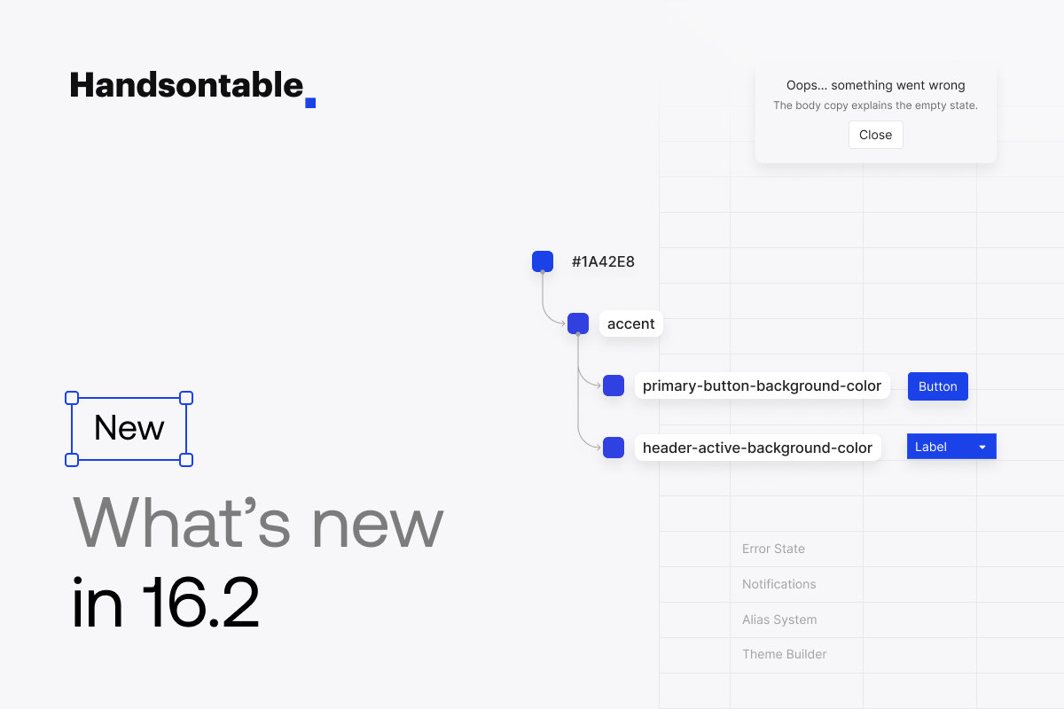
Handsontable 16.2 is designed to simplify building data grids that look and behave like a natural part of your product. This release is especially useful for teams who care about consistent design, intuitive UX, and reducing the overhead of custom UI work.
If you’re a developer or designer working with a design system, the new CSS variable structure gives you more control over theming, and the improved Theme Builder lets you experiment with styles visually. If your app relies on filtering or dynamic data, the new empty state plugin gives users clear, contextual feedback when there’s nothing to display. And for product teams needing a simple way to handle confirmations, errors, or user prompts, the updated Dialog plugin makes it easy to add actionable UI feedback directly in the table.
CSS Variables Update: A New Alias System for Consistent Theming
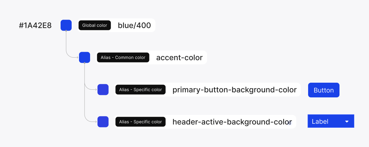
Handsontable 16.2 introduces a redesigned CSS variable system built around a clear alias hierarchy, making theme customization faster, more predictable, and easier to maintain. While previous versions already supported CSS variables, this release organizes them into a structured three-level system:
- Global colors: the core palette values (e.g.
accent/400,gray/200). - Common colors: Semantic aliases for high-level concepts like foreground, background, and borders.
- Components: Specific styling tokens used by individual UI elements (like pagination, headers or checkboxes), which inherit values from Common or Global levels depending on the use case.
The relationship is simple: Global → Common → Components
Components inherit values through the alias chain, so when you override a Global or Common variable, the change cascades through all component-level variables that depend on it. The higher up in the hierarchy you make a change, the more of the UI it affects.
Take a look at the example below:
--ht-color-gray-800: #222222; // Global color
--ht-common-foreground: var(--ht-color-gray-800); // Common alias
--ht-pagination-bar-foreground-color: var(--ht-common-foreground); // Component level
In this setup, changing the --ht-color-gray-800 (Global color) updates the Common alias and, in turn, all components that reference it, such as the pagination bar in this case. This pattern is now the recommended way to structure your custom themes in Handsontable, allowing a single update to cascade across the entire UI.
This structure brings a few key benefits:
- Theming becomes simpler: It significantly reduces the need to override hundreds of individual, component-level variables when building or adjusting a theme. You can now control broad areas of the UI with just a few well-placed updates.
- Better alignment with Figma design tokens: The alias structure mirrors the typical structure of design tokens in systems like Figma, making collaboration between designers and developers much smoother.
- One change can theme the whole UI: For example, updating
--ht-common-foregroundinstantly affects related text/icon colors across the grid. Adjusting--ht-common-borderupdates borders consistently everywhere. - Icons and themes: Icons are no longer tied to a specific theme, meaning you can freely mix icons from one theme into another (e.g. using Main Theme icons in a Horizon Theme)
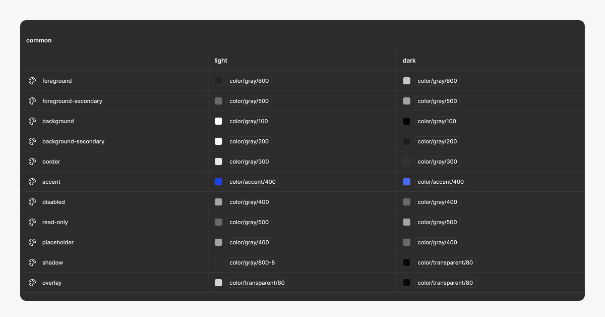
If you want to explore the complete alias hierarchy and color structure, you can also find all tokens in our Design System.
Please note that the new alias structure is fully backward-compatible. Existing themes will continue to work, but adopting Common variables will make future customization significantly easier.
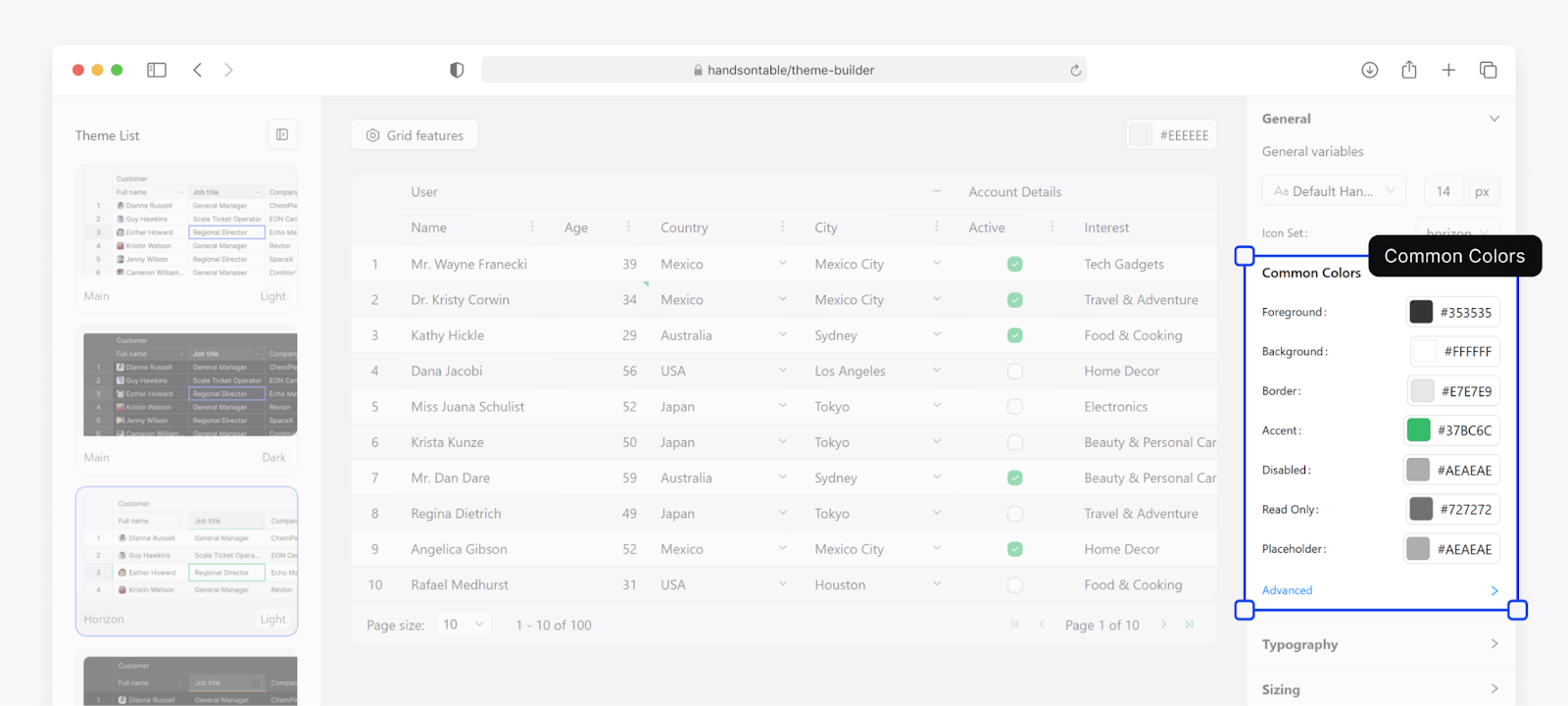
Handsontable Theme Builder
Making it easy to align Handsontable with your design system is one of our core goals, not just for visual consistency, but also to support scalable and maintainable UI workflows across teams.
The Theme Builder is our no-code tool built for exactly that. It lets you visually customize the look and feel of the data table without touching the codebase. You can quickly adjust colors, spacing, and typography to create themes that match your brand, support specific user flows, and fit right into your product’s design system. It’s created to help both developers and designers work faster and stay aligned.

With the Theme Builder, you can:
- Adjust colors, spacing, and typography through a visual interface
- Preview changes in real time
- Export themes as CSS variables
- Generate a working StackBlitz project with the applied styles
In 16.2, the Theme Builder has been updated to reflect the new variable architecture. It’s now more intuitive, better aligned with how themes are structured under the hood, and faster to work with, whether you’re testing ideas or building a production-ready UI. We are committed to expanding this tooling in future releases to make styling Handsontable as flexible and design-friendly as possible.
Built-In Notifications for Empty Tables
In Handsontable 16.2, we’ve introduced the new EmptyDataState plugin to improve how the table communicates when there’s no data to display. In earlier versions, when the grid had no data due to filters or an empty dataset, it would display only the headers without any contextual message.
New plugin automatically detects these scenarios and replaces the table with a customizable message, providing users with clear feedback and guidance on what to do next. It supports internationalization, accessibility, and styling via theme variables, and works out of the box with filtering and search.
The plugin is highly configurable, allowing you to define a custom title, description, and one or more action buttons with callbacks. For example, an “Add Sample Data” button can be displayed when there is no data to show:
new Handsontable(element, {
  data,
  emptyDataState: {
    message: {
      title: 'No data available',
      description: "Please add some data to get started.",
      buttons: [
        {
          text: 'Add Sample Data',
          type: 'secondary',
          callback: () => {
            // custom logic
          },
        },
      ],
    },
  },
});
The plugin also exposes utility methods and lifecycle hooks for advanced control. You can check if the overlay is visible using isVisible(). It also includes four plugin-specific hooks that allow you to run logic at different stages of the empty state lifecycle:
Additionally, two new core hooks, afterColumnSequenceCacheUpdate and afterRowSequenceCacheUpdate, are now available for handling changes to internal row and column sequence caches.
Add Actionable Feedback to Your Table UI
Another notification-related update is the extension of the Dialog plugin with a new Template option, as well as two new helper methods: showAlert and showConfirm. These additions make it significantly easier to display alert-style modals for error messages, confirmations, and custom notifications without manually constructing dialog elements.
The showAlert method allows you to quickly show a styled error or status message with a single callback, while showConfirm supports basic OK/Cancel interactions. For more flexibility, the show method now accepts a template object, where you can define the dialog type, title, optional description, and a fully custom set of buttons with labels, styles, and callbacks.
Ensure Compatibility with Angular 21
For teams planning to upgrade to Angular 21, Handsontable 16.2 is the minimum required version to ensure your table works smoothly. This update addresses compatibility issues introduced in the Angular 21 release, so be sure to update your Handsontable dependency when making the switch.
Help Us Improve
We’re running a short release survey to hear what you think. You can quickly rate the new features, changes, and improvements in 16.2 using a simple star-based system: no long forms, just a few clicks. Your feedback helps us shape future releases.
Thank you in advance for taking a moment to share your thoughts!
Release Notes
Added
- Improved focus management by introducing a focus scope mechanism. #11804
- Introduced an “auto” option for the
roundFloatsetting in the Column Summary plugin and ensured proper recalculation of endpoints after data updates. #11833 - Added an Enter key handler and a new
searchModeoption to the Filters plugin. #11871 - Implemented a
styleoption for the Custom Borders plugin, enabling style customization. #11876 - Introduced a new “dotted” border style to the Custom Borders plugin. #11877
- Added the
EmptyDataStateplugin to improve UX when no data is available. #11879 - Added a
settingsentry to the Handsontable exports. #11883 - Added new global button CSS class names. #11896
- Introduced
minRowHeightsas an alias forrowHeightsfor API consistency. #11898 - Added a new
templateoption to the Dialog plugin. #11902 - Added new theme variables and implemented
no-iconsandicons-onlystyle variants. #11913
Changed
- Refined dropdown behavior when the input is empty – focus now remains on the input field. #11863
- Improved how the Autocomplete and Dropdown editors respond to clicks outside the open editor. #11873
- Reverted the editors’
updateChoicesListmethod type change. #11943
Fixed
- Fixed the datepicker icon size issue on iPad. #11860
- Corrected header size rendering on iPad. #11861
- Fixed an issue with the header text size with
collapsibleColumnsenabled. #11864 - Fixed an issue with an unwanted empty space on the right side of the table when using the modern themes. #11868
- Fixed row misalignment for multi-line cell content. #11872
- Improved column width calculations for checkbox-typed cells. #11891
- Fixed a problem where using
minSpareRowswould crash the table when configured alongside the Column Summary plugin. #11911 - Fixed an issue preventing re-adding a previously removed hook callback. #11914
- Stabilized the height of the first row when it’s empty. #11918
- Fixed a problem where resizing the window vertically did not resize the table. #11919
- Fixed an issue where the dialog overlay could make the table unresponsive after rapid show/hide calls. #11925
- Fixed an issue with TouchEvent on Firefox. #11928
- React: Fixed an issue with Collapsible Columns being reset in the React wrapper. #11923
Security
- Updated dev dependencies to address high-severity vulnerabilities. #11895
Figma
- Released version 1.3 of Handsontable Design System.
Beata Mówka
Senior Marketing Manager at Handsontable