This is a guest post written by Widelab, a team providing the mixture of UI/UX design, app development, and business skills to create a unique online organism.
Let’s start with a little background. Handsontable, created in 2012, is a JavaScript data grid component for web applications. We were approached by the product’s creators to redefine their brand and help reflect the company’s key values in its brand visuals.
Thorough research into the company’s history, target group, competitors, and market context allowed us to precisely define Handsontable’s position as a leading web development brand.
The process involved:
- A questionnaire with a set of questions about the brand;
- A workshop with a few exercises helping us define Handsontable’s tone of voice, and choose a visual brand strategy;
- A mood board filled with inspiration;
- A presentation with logo and key visuals ideas;
- Final deliverables and a brand book defining brand guidelines.
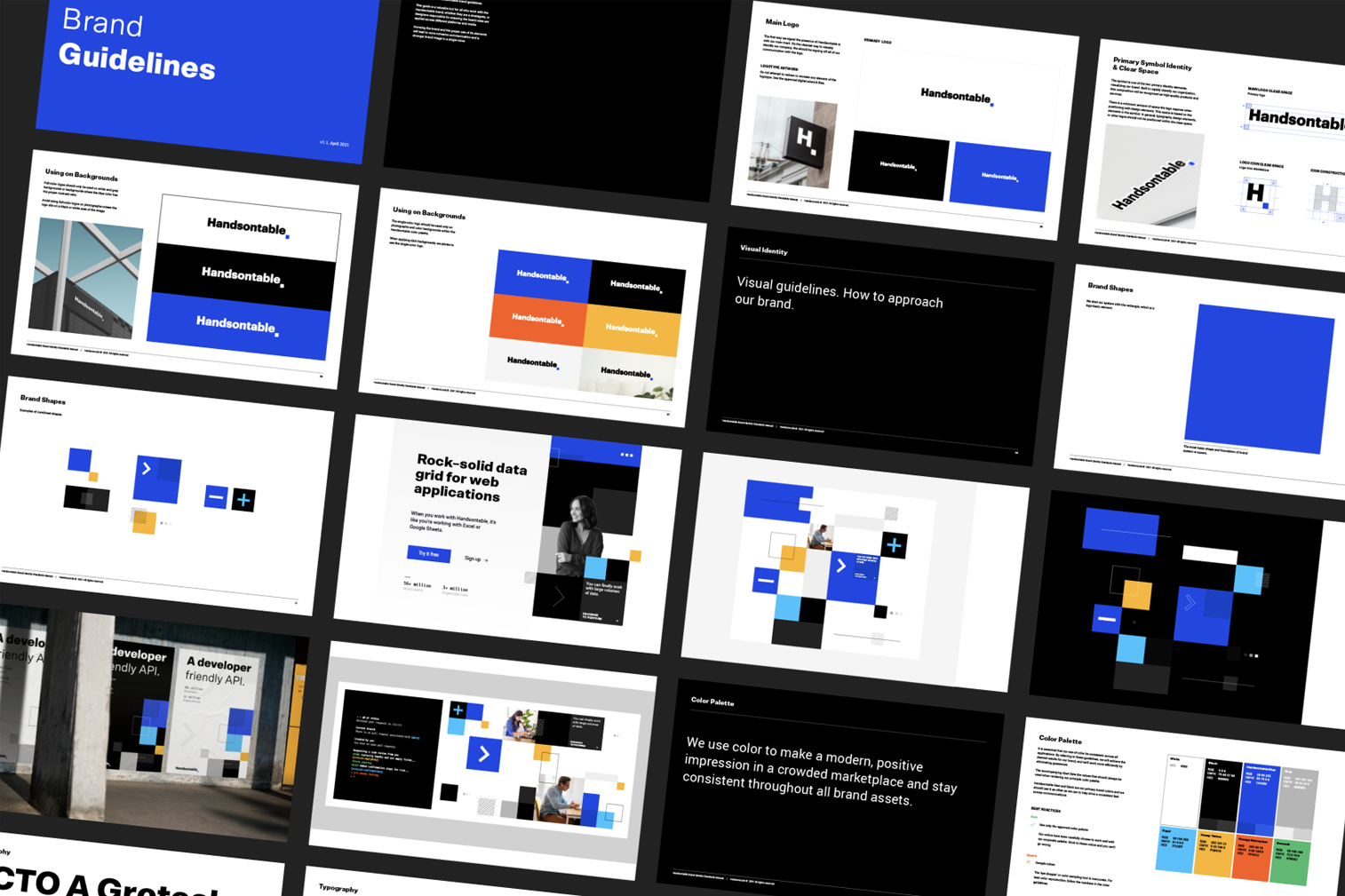
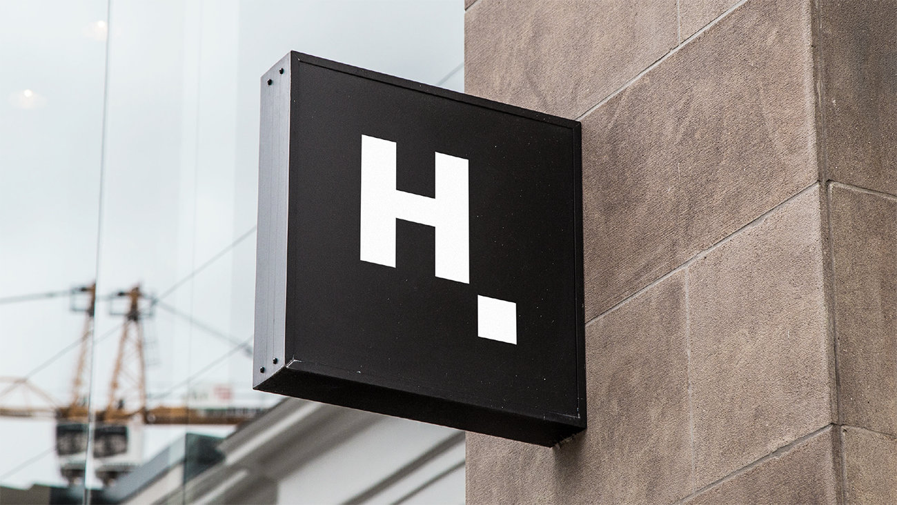
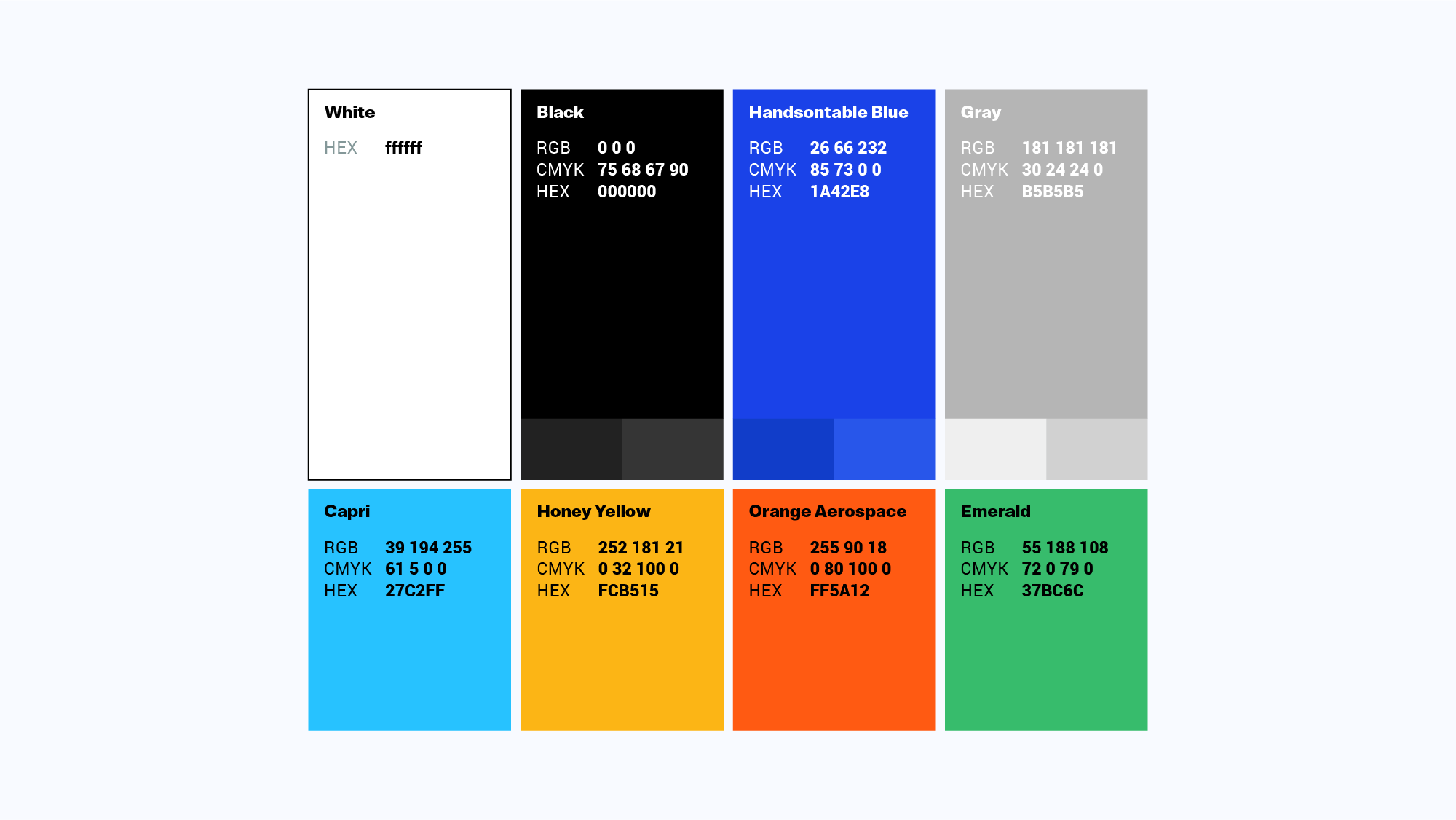
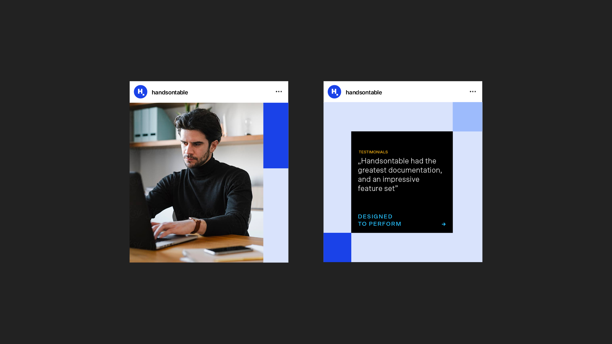
We developed a new brand system that contains elements such as a logo glyph, logotype, color palette, typography system, brand patterns, and visuals. After our meeting with Chris, Handsontable’s CEO, and Beata, the Marketing Manager, we decided to keep the idea of the square in the logo, which represents the concept of a cell selection in a spreadsheet. This is the foundation of branding.

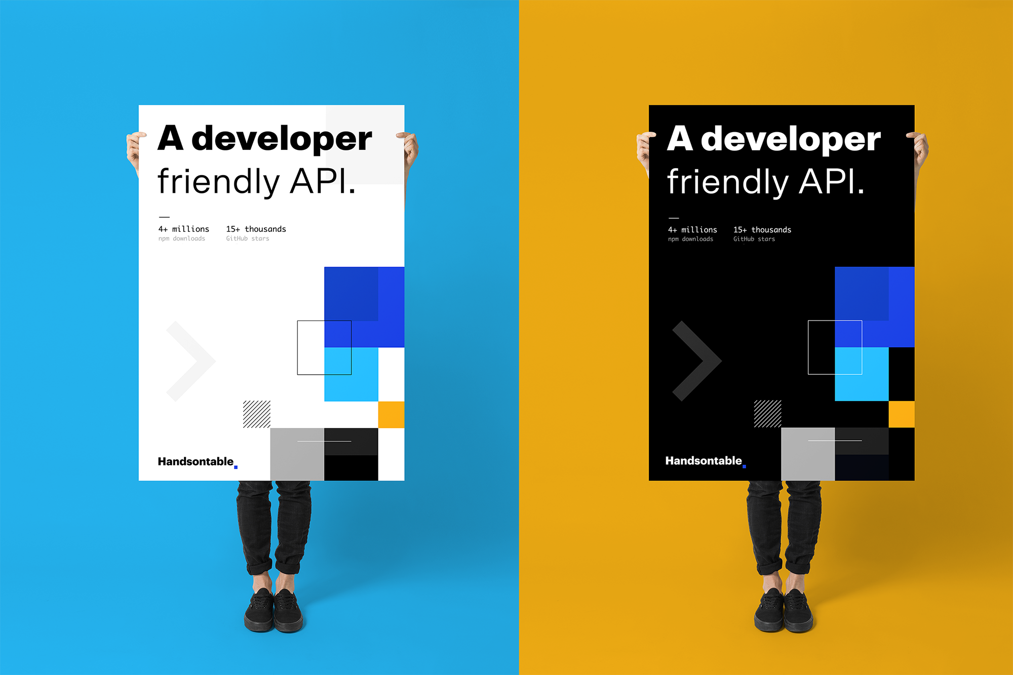
Their visual identity is a flexible system that starts with the square shape — this is where the magic happens. We’ve developed a branding that lets us create an unlimited number of designs within the brand shapes. With the typography system, we wanted to convey particular values within them, like accessibility and security. In addition to the branding, Handsontable received a Brand Guide with detailed instructions on how to create new design materials on their own, to stay consistent through all brand touchpoints.
The evolution of the brand is a big step in Handsontable’s visual presence, yet it retains all the basic elements that the brand was presented with to its very first audience. We strongly believe it will have a positive reception among their target group and that it opens a door to a wider audience. We hope that the visual transformation will also change the brand perception for a more appealing, more catchy, and more professional feel.
It was a pleasure to be working on this project with the Handsontable team. Ultimately, we created a brand book that is a foundation for all future company marketing initiatives.

Mateusz Urbańczyk
Senior Brand Designer. Brand concept creator at Widelab.