Introducing the New Handsontable Logo
 News / September 13, 2017
![]()
Often, what is meant to be temporary ends up staying with us for far longer than originally intended. Back in 2014, just before we launched the commercial version of Handsontable, we introduced our new logo. What we needed at the time was something that would help us mark our presence on the market. To be frank, we didn’t spend much time designing it, since we were busy preparing for the launch. The result was a mix of our ideas, but it lacked consistency and flair. Even so the logo has survived for nearly 18 months. Much longer than anticipated.
Part of our original idea was to create a connection of twisted hands, with the letter H inside. And there is a 3D perspective to it too, if you look at it as a cube.
Wicked thing!
It was the result of interpreting the words Hands-on-table very literally. For the typography we used the uppercase version of “Source Sans Pro” which, with the benefit of time, now looks too indistinct, and even a little aggressive. None of our team members liked it much, but as I said earlier, time was running out and we had no choice but to pick anything that was somewhat acceptable.
The Creative Process Behind our new Logo
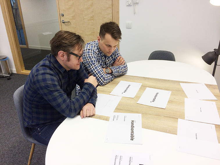
The driving — and creative — force behind our new logo is our brand designer, Marcin Kordacki. Marcin joined us in February 2017, and immediately took on the responsibility of designing a new logo based on our input and an accumulation of customer feedback. We shared with him all our thoughts and assumptions about how our product is currently seen in the market, and how we’re going to position it in the future. He came back to us with a cloud of word associations, a mood board, and a bunch of ideas on how to best bring our new logo to life.
The final idea was simple: tell the world that Handsontable is a beautiful, professional spreadsheet. But keep it simple. Very simple.
We chose to form our logo around two elements: our name — Handsontable — which is the main differentiator of our brand, and the small element at the end of it which is associated only with a grid’s cell — a fill handle (or drag-down button). That small square at the bottom right corner of a cell typically allows you to populate data into another cell or group of cells. It’s very typical of spreadsheets and doesn’t exist anywhere else.
This time it took us several hours to first pick the right font — with us ultimately agreeing on using Nimbus Sans. Nimbus Sans is a beautiful iteration of the world’s most loved font — Helvetica. And choosing a color was never a problem since we prefer the old school approach to logos, which demands the use black or white only.
The Final Result
So now it is time to reveal the result of this creative process — I’m happy to present to you the new logo of Handsontable. This time created with great care, and the intent of conveying the right message to our customers.
I hope you like it!
Aleksandra Budnik
An expert in research and analytics. She also used to run her own e-commerce business.