Guide to React portals: What are they?
 Tools / January 16, 2023
React is a popular choice when it comes to building web applications, thanks in no small part to its large assortment of features and functionality. One such feature of React is portals. According to React’s documentation:
“Portals provide a first-class way to render children into a DOM node that exists outside the DOM hierarchy of the parent.”
If you’re unfamiliar with portals, this might seem strange initially, but there are several excellent use cases for this functionality.
In this article, you’ll learn all you need to know about React portals, including use cases where they make sense, their semantics and syntax, and everything else you need to know to leverage them in your projects.
Why do you need React portals?
When rendering components to the DOM in React, child components will be mounted within their corresponding parent node. This makes React applications easier to reason about as they closely resemble traditional HTML, and the code you write is relatively representative of the underlying DOM structure. In some cases, however, you might want to insert a child node into a different location in the DOM.
Logically decoupled components
One of the most common use cases for portals is invoking a component from one place in the DOM but having it render to a different place. An example is a dialog or modal UI pattern.
Typically, dialogs will take over the whole screen, which could be quite awkward to implement from deep within the DOM. Using portals allows you to have the dialog rendered higher up in the DOM where it semantically makes sense to do so – somewhere that it can logically be displayed on top of your other content without you needing to do hacky overrides.
Visual breakouts
Another common use case is when you need a child component to be visually decoupled from its parent and to “break out” of its traditional layout. This kind of usage is commonly seen with Poppers, Tooltips, and other UI patterns that, like the dialog, are rendered in ways that seem at odds with how they’re invoked, even if they don’t take over the entire screen as the dialog does.
Most use cases for React portals fall into these two categories, but you can use portals anytime you need to invoke a component in one place and render it in another.
What you need to know about portals
React portals were introduced in 2017 with version 16.0, alongside other mainstays like custom DOM attribute handling and error boundaries.
As with many of the additions to React over the years, when portals were introduced, they were not done so prescriptively, meaning React doesn’t force you to use portals. Instead, they’re available to solve the common problem of rendering components that cannot or should not be nested under their parents.
In this regard, they’ve been a great success. Portals have seen widespread adoption by React application developers for their intended use cases. They ease the burden associated with implementing this type of UI pattern quite substantially, where the alternative would be to either code something bespoke – that would likely have its own issues – or, as mentioned above, to use hacky overrides.
Benefits of portals
One of the nice things about portals is the consistency provided by their abstraction. Although your component will be rendered differently under the hood, the developer experience remains the same.
Portal-rendered components will behave the same as normal components in all other regards, meaning that they can still access data from Contexts, and Events will still bubble up to their component ancestors even if they’re not DOM ancestors.
When using portals, there are still a few things you need to be aware of, as it’s possible to make some mistakes that could lead to a degraded user experience.
Limitations of portals
When using portals, managing keyboard focus is quite important; you must ensure that things like modal dialogs accurately follow the WAI-ARIA Modal Authoring Practices. This includes stipulations such as the following:
- When you open a dialog, the focus moves to an element inside the dialog.
- Tabbing through focusable elements will cycle through elements of the dialog only (focus should not escape the dialog while it’s open).
- The Escape key should close the dialog.
Naturally, if you’re implementing a dialog from scratch, you’ll need to consider these constraints to deliver a good user experience. The portal does not handle these implementation details for you, so while this isn’t necessarily a drawback of the portal itself, it’s still something you need to be aware of.
The best way to get a feel for how to use React portals is to try them out yourself. In the next section, you will see how to implement a basic dialog using a portal.
How to use portals
You can see the final product on StackBlitz if you want to see how it comes together, but if you’d like to follow along, you can either create a new React app or you can use this barebones StackBlitz project. This section will assume you’re using the StackBlitz approach.
The first thing you’ll need to do is ensure that there’s somewhere for your portal to mount. If you open public/index.html, you’ll see that it currently contains a div with an id of root. Create another div as a sibling to this one, and give it an id of portal like so:
<div id="root"></div>
<div id="portal"></div>
Most of your application will be mounted hierarchically into the root div, except for your portal content.
Next, create a new file in the src/ directory called Dialog.js and add the following content:
import React from 'react';
import ReactDOM from 'react-dom';

export default function Dialog({ open, handleClick }) {
  if (!open) {
    return null;
    }

  return ReactDOM.createPortal(
    <div className="dialog">
      <div className="inner">
        <span>Content inside dialog</span>
        <button onClick={handleClick}>close dialog</button>
      </div>
    </div>,
    document.getElementById('portal')
  );
}
This is a very simple component, but it’s where the magic happens. Instead of returning a component as JSX, as a normal component would, this one returns a call to ReactDOM.createPortal(), a function that takes two arguments.
The first argument is the component you wish to render inside the portal – in this case, a simple dialog. The second argument is the DOM node to which the portal will be mounted – the one you created in the previous step.
To invoke this component, you must add it to your src/App.js file. Go to that file, and replace its content with the following:
import React from 'react';
import './style.css';
import Dialog from './Dialog';
export default function App() {
const [open, setOpen] = React.useState(false);
function handleDialogOpen() {
setOpen(true);
}
function handleDialogClose() {
setOpen(false);
}
return (
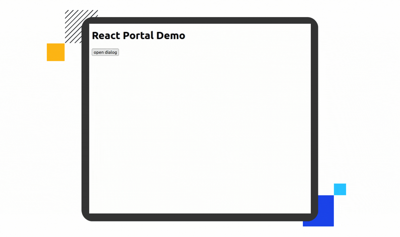
<div>
<h1>React Portal Demo</h1>
<button onClick={handleDialogOpen}>open dialog</button>
<div id="dialog-wrapper">
<Dialog open={open} handleClick={handleDialogClose} />
</div>
</div>
);
}This is essentially just your dialog, a button to trigger it, and a state hook to track whether it’s open or not. Do note the div with the id of dialog-wrapper, however. This will be used shortly to demonstrate the portal in action.
Finally, go to src/style.css and replace its content with the following:
.dialog {
  position: absolute;
  top: 0;
  left: 0;
  bottom: 0;
  right: 0;
  background-color: rgba(0, 0, 0, 0.25);
  display: flex;
  justify-content: center;
  align-items: center;
}

.dialog .inner {
  background-color: white;
  width: 200px;
  height: 200px;
  border-radius: 10px;
  padding: 12px;
  box-shadow: 5px 5px 15px 5px rgba(0, 0, 0, 0.32);
  display: flex;
  justify-content: center;
  align-items: center;
  flex-direction: column;
  margin: 12px;
}
These are simply some basic styles to make the dialog feel more like an actual dialog pop-up. Save your changes if you haven’t already, and you should now be able to interact with your modal in StackBlitz’s preview window.
Although this contrived example lacks some of the accessibility considerations mentioned above, its core functionality behaves as expected.
There’s more to see, however. Right-click somewhere in the preview and select Inspect to open your browser’s dev tools. If you go to the Inspector or Elements tab, you can see the DOM tree that’s currently rendered. Look at it while the dialog is closed, and you should see something like this.
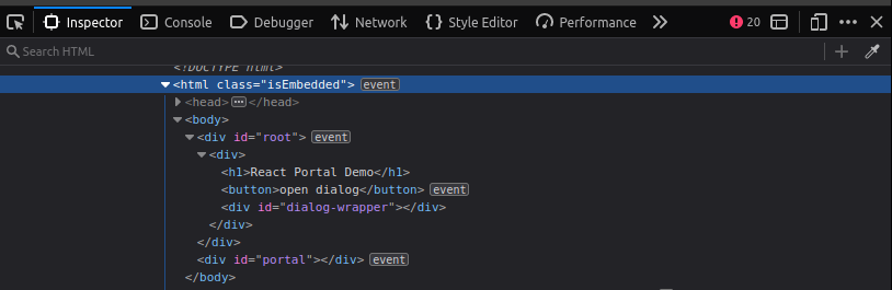
This is closely representative of the React components that you wrote. Now, open the dialog and have another look.
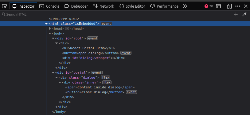
You can see that the new nodes were mounted inside the div#portal node instead of the div#dialog-wrapper node, as in the source code. This is the portal in action.
You can see the finished application if you’d like to double-check anything.
Wrapping up
In this article, you learned about React portals. You heard what problem they were intended to solve, and you’ve seen an example of how they work in practice. Portals are a powerful tool for React developers, enabling interesting and creative solutions to otherwise tricky problems. The developers at Handsoncode know this to be the case, as they’ve leveraged React portals to optimize the performance of their Handsontable data grid component.
If you’re on the hunt for a powerful and performant data grid, go ahead and give Handsontable a try today.
Cameron Pavey
Full-stack PHP/JS Dev 🚀 Code and fancy keyboards.