From Components to Tables: Designing a Data Table Component in Your Design System
 Design / January 26, 2026
Although data tables often appear straightforward, designing one that actually works is anything but simple. Taking a design-led approach to building a data table component within a design system, this walkthrough covers how to design a data table, what can go wrong, and how to avoid the pitfalls that only surface after your design leaves Figma and meets reality.
The Illusion of Control
As designers, we live for Auto Layout, Variants, and clean component nesting.
Building a button? Ten minutes. A dropdown? Maybe half an hour.
We believe our design system can handle everything. And for 90% of UI elements, we’re absolutely right.
But then comes the monster. The one component that requires infinitely more than just styling and state: the data table.
When a simple five-row list turns into a mission-critical financial grid supporting 100,000 rows, inline editing, and complex range selection, our beautiful Figma components quickly hit a wall. Suddenly, we realize we’re not just designing borders and padding; we’re designing a mini-product inside the main product.
This sudden shift from “easy” to “hard” is something our engineering team at Handsontable is very familiar with. A data table may seem simple, but building a strong and fast one can create significant problems for developers later. That’s precisely why we built Handsontable: to provide developers with a complete, proven tool, so they never have to solve these tough, technical problems from scratch.
But let’s dig into the reality of designing at scale.
Act I – The Atom and The Masterpiece
When we think about the table regarding the Atomic Design approach, we can divide it into four levels:
- Atom – Cell
- Molecule – Row or Column
- Organism – Table
- Templates – Table with controls around
We start where every good design system journey begins: with the smallest, most manageable unit. In this context, that refers to the Cell.
The Atomic Unit: The Cell Component
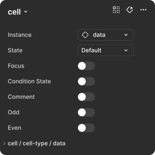
The cell is the heart of your data presentation. If you get the cell right, the whole table structure becomes scalable. In Figma, we approach this by creating a complex Cell component with multiple property sets.
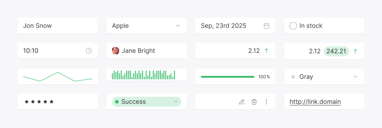
| Instance The content inside a cell is rarely just plain text. It needs to handle different inputs and formatting. | Text: A simple string value, usually left-aligned, used for names, labels, and descriptive content. Number: A right-aligned value, often formatted with decimals or currency symbols, optimized for numeric comparison. Date: A formatted date value, frequently paired with a calendar icon for a date picker. Checkbox: A boolean control used for status flags, selection states, or simple true/false values. |
Note: Alignment Variants (for i18n / RTL)
Beyond the cell type itself, alignment variants must support flexible text direction and layout. For example, while numeric values typically default to right alignment in Western (LTR) languages, the component still needs explicit alignment variants such as Alignment = Left, Alignment = Center, and Alignment = Right.
This becomes especially important when supporting right-to-left (RTL) languages like Arabic or Hebrew. In these contexts, the entire layout is mirrored, and the default alignment for text often shifts to the right, even for content that would normally be left-aligned in LTR layouts.
When naming alignment variants, prefer Alignment = Start and Alignment = End instead of Left and Right. This approach future-proofs the component:
– Start maps to Left in LTR (left-to-right) contexts
– Start maps to Right in RTL contexts
Always favor logical direction over physical position when defining alignment in a design system.
| States This is where visual feedback happens. You need to define how the cell appears when a user interacts with it. | Default: The resting state, kept visually simple to avoid unnecessary noise. Hover: A subtle color change that signals interactivity without distracting from the data. Selected: A clear background or border treatment that shows the cell is part of an active selection. Focused/editing: A state that often replaces the text label with an input component and uses a strong border to clearly indicate that the user can actively type. Disabled: A slightly muted appearance, such as lighter text or background, signaling that the value cannot be edited. |
| Condition States Beyond simple interaction, the cell must communicate data status using visual signals. | Success: A green visual indicator showing valid or positive data. Warning: A yellow indicator drawing attention to potentially problematic or incomplete data. Error: A red indicator signaling invalid input or a failed validation state. |
| Utility Overlays These visual features support readability and collaboration. | Zebra (odd/even striping): Alternating row backgrounds that make it easier to scan wide tables horizontally. Comments indicator: A subtle, non-intrusive marker (similar to Excel) indicating that a cell contains an attached note or comment. AutoFill handler: A small square handle in the bottom-right corner of a selected cell or range, used for pattern-based data extension. The AutoFill handler is a key interaction signal. Its size (for example, 4×4px), color and visibility rules must be clearly defined and shown only when a selection is active. |
Note: Truncation and Ellipsis
A critical detail often overlooked when designing a simple cell is how to handle text that exceeds the column width. When content is longer than the available space, the default behavior should be to truncate the text and display an ellipsis (…).
This requires an explicit text style configuration in the Figma component to ensure the content remains on a single line and truncates consistently across all cell states.
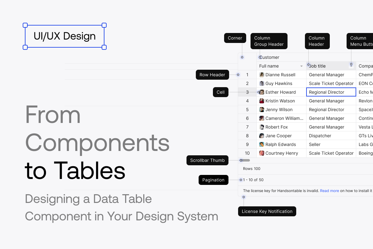
To complete the Atom level, we usually need three additional specialized cells: Column Header Cell, Row Header Cell, and Corner Cell.
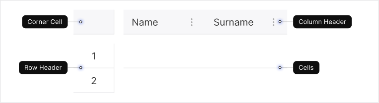
| Column Header Cell This component lives at the top of the column and must be designed separately from the data cell. | Visual: A distinct, heavier background color or stronger typography to clearly separate it from the editable data area. States: Variants for Header/Default, Header/Hover, Header/Highlight, Header/Selected, Header/Focus, and Header/Filtered. Alignment: The alignment should match the content under the column to maintain visual consistency. Interaction: The text label requires a different interaction model than regular cells, as it acts as both a label and a control surface. – Sorting icons: Up, Down, and Neutral states that indicate whether data is sorted and in which direction. – Filter indicator: A visual signal showing that a column has an active filter applied, often combined with a background or icon change. – Column moving: A drag handle that appears on hover, signaling that the column can be repositioned via drag-and-drop. – Hidden column indicator: A signal that informs users that one or more columns are currently hidden. – Column management: A menu icon, visible always or on hover, providing access to actions such as Hide Column, Pin Column, Copy, Filter, Conditions, and other column-specific options. – Column grouping and nesting: Support for multi-level headers, including collapsing and expanding grouped columns. – Column freezing indicator: A strong visual divider that marks the boundary between frozen and scrollable columns. |
| Row Header Cell This cell runs along the far left edge of the grid and serves as a navigational anchor. It typically contains the row number. | Interaction: Its key states are Header/Highlight and Header/Active. Many interactions are similar to Header Cell: Row grouping and nesting, Row Freezing Indicator, Hidden row indicator, and Row Moving. Additional elements often added: – Row selection checkbox: Enables batch actions across multiple rows. – Drag-and-drop icon: Makes row reordering more discoverable. – Plus icon: Allows users to quickly create a new row. – Expand icon: Supports collapsible or nested row structures. |
| Corner Cell This small component, located where the Row Header Column meets the Column Header Row, is the master control of the grid. It needs careful design as it controls the entire data set. | Identity: Visually neutral, but interaction-critical. Master selection checkbox: Supports three states: – Unchecked: Nothing is selected. – Checked: All visible rows and columns are selected. – Partial/Indeterminate: Only part of the data set is selected. This must use the standard partial checkbox icon. Master freeze/pin indicator: If you have fixed columns or rows, this cell should display a clear visual divider along its bottom and right edges, indicating the point where the fixed area ends and the scrollable area begins. Loading space: Because selecting all data often triggers a large load operation, this cell is a good, fixed spot to display a small loading spinner (replacing the checkbox) to indicate that a global action is in progress. |
If you get the cell wrong, everything breaks later. That’s why rigorous Atomic Design matters here.
You have now completed the hardest, most detailed part of the design specification. We have defined every single cell variant, state, and interaction feature for the three main cell types and the critical corner cell. This detailed work is the foundation—the visual contract—that the development team will use to build the table.
Now we move on to assembling these atoms into the final structure.
The Molecule Component: The Assembly Dilemma
Now that all three cell types are defined (Cell, Column Header Cell, Row Header Cell), we face the first major structural decision in Figma: how should these pieces be assembled?
There are two common ways to approach table assembly, each with its own advantages and drawbacks in the Figma environment.
- Row-first thinking (user view): This is the more intuitive approach. You start with a Row Header Cell and place Data Cell components next to it horizontally using Auto Layout. The benefit is immediate: you can clearly see the final visual result and how data connects from the user’s perspective.
- Column-first thinking (designer workflow): In Figma, however, a strictly row-based structure becomes difficult to manage over time. The most common table-related task is resizing or replacing columns. When a table is built as a collection of rows, changing the width of a single column — for example, the “Name” column — requires updating the corresponding cell in every row instance. This quickly becomes slow, repetitive, and error-prone.
The choice is yours. Do you prioritize the integrity of the column for easier resizing and maintenance, or the integrity of the row for clearer visual context?
At this point, your Molecule is ready.
The Organism: Building the Grid
The final step in Figma is to combine your Molecules into a single Organism: the Table.
Use Auto Layout and set the table component to Fill container horizontally and Hug contents vertically. This allows the table to respond naturally to screen width while preventing unnecessary vertical scrolling inside the component itself.
At this stage, it’s also a good moment to add both vertical and horizontal scrolling to the table, reflecting how it will behave in real use.
That’s it for the Organism level. Now it’s time to move to the final layer of our monster, the Template level in Atomic Design theory.
The Template Component: The Final Application View
Now that the core grid (the Organism) is built, it’s placed inside a larger template that provides the tools users need to interact with data at the application level.
This template usually consists of two horizontal Auto Layout frames — Header/Tools and Footer/Pagination — surrounding the central grid.
| Header Tools (top frame) The area directly above the grid holds global controls. | Title Bar with actions: Balances context (the table title) with global actions such as search or filtering. Filter Bar: A dynamic area that shows the current data view state and applied filters. Toolbar: A more advanced formatting toolbar, similar to what you find in spreadsheet tools like Excel. |
| Footer Tools (below the grid) The area below the grid supports navigation, context, and feedback. | Pagination: Controls for navigating large datasets (for example, “Page size: 20” or “Page 1 of 5”). License/metadata: A space for important application status messages or licensing information. Status Bar: Provides essential context about the data and the current selection. Tabs (sheet navigation): Located below the table, this component acts as the primary navigation for switching between separate datasets (sheets). It allows users to manage multiple complex views within a single instance, similar to Excel. |
| Additional elements | Empty States: Appear when the grid has no data, filters return zero results, or the user lacks permissions. They should include a short message, a simple icon, and an optional action (for example, “Add row” or “Clear filters”). Their purpose is to guide the user, not leave them with a blank screen. Modals: Used for actions that require confirmation or additional configuration outside the grid, such as adding columns, advanced filtering, destructive actions, or editing records in a form view. Keep them focused, with clear hierarchy, a well-placed primary action, validation feedback, and proper accessibility (focus trap, background lock). Sidebars: Ideal when users need to view and configure data simultaneously. Use them for row details, filtering panels, column management, or contextual metadata. Sidebars provide more continuity than modals, by keeping the table visible while the user works. |
Since Act I focused on the design specification in Figma — the visual contract — Act II shifts to what happens next. This is where a seemingly simple component is pushed to handle real scale, real data, and real performance constraints, and where design decisions meet the engineering challenges behind a working data grid.
Act II – Hitting the Wall: The Engineering Nightmare
In this act, we move beyond Figma and focus on what it takes to turn a static table design into a functional, high-performance data grid. Here, the data table is treated as a technical system, where design decisions must support scale, performance, and complex real-world usage.
The Illusion of Infinite Rows
The biggest mistake designers make is assuming that a five-row Figma mockup will scale to 100,000 rows in a real application. It won’t. This section explains why that assumption breaks down, and what the technical solution looks like.
The DOM Problem
When tens or hundreds of thousands of cells are rendered at once, the browser’s Document Object Model (DOM) becomes overwhelmed. The result is slow performance, laggy interactions, crashes, and a poor overall user experience.
What appears as a simple table in design quickly turns into a serious performance issue in implementation.
The Solution
The technical solution to this problem is row and column virtualization:
- Concept: Only the rows and cells visible within the viewport — plus a small buffer — are rendered at any given time. The grid creates the illusion of a massive table, while in reality, only a small fraction of the total data exists in the DOM.
- Design implications: Virtualization directly affects design decisions. Scrollbars, for example, must accurately represent the full size of the dataset, even though most of the data is never rendered. Loading states also need to feel seamless, and interactions like selection and scrolling must remain predictable as users move through data that isn’t physically present.
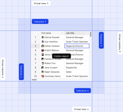
At this point, the table stops behaving like a simple list and starts behaving like a system designed to simulate one.
State Management: The Grid is a Mini-Application
A data table isn’t just a display component; it’s a transactional interface that requires complex state management.
Unlike simple UI components, a grid needs to handle multiple layers of state at the same time. In addition to familiar interaction states (such as Default, Hover, Selected, or Focused/Editing), each cell also carries a data state. These states must work together without conflicting or confusing the user.
Complex Cell States vs. Simple Component States
At this level, the importance of clearly defined cell states becomes even more apparent. Visual feedback needs to communicate not only interaction, but also data validity and status, often simultaneously.
The Edit and Validation Cycle
Editing data inside a grid follows a clear cycle that must be intentionally designed.
- Entry: Design how the cell enters edit mode. Typically, the Focused/Editing state replaces the text label with an input component, clearly indicating that the user can start typing immediately.
- Validation: Design how invalid data is communicated. The table should provide immediate visual feedback — for example, by applying an Error condition state — before the user leaves the cell or submits the row.
- Exit: Decide how the table handles loss of focus (Blur). Should the value be saved automatically, or should the user be prompted to confirm or correct the input? This choice has a direct impact on user trust and workflow speed.
These decisions shape how reliable and predictable the grid feels in everyday use.
Column Strategy: The Dynamic Grid
The row-first vs. column-first dilemma you face in Figma doesn’t disappear in code; it turns into a performance and flexibility problem.
How you design columns directly affects how the grid resizes, scrolls, and scales once it’s implemented.
| Defining Column Widths (static vs. dynamic) One of the first decisions to make is how column widths should behave. | Fixed width: This is the simplest approach to design and implement. Columns have predefined widths that don’t change based on content. While this is predictable, it quickly becomes inflexible when data varies or layouts need to adapt. Content-aware (auto-fit): In this approach, column width is calculated based on the content of cells, including the header. From a design perspective, this often feels “right,” but it comes at a cost. Developers must temporarily render content to measure it, making this a computationally expensive operation. |
| Handling Resizing and Freezing Beyond width definitions, columns also need to support direct user interaction. | Resizing handle design: The small visual affordance on the Column Header Cell, typically a vertical line or draggable area, isn’t just decorative. When a user drags it, the entire grid layout must update dynamically. This means resizing one column often triggers recalculation and re-rendering across the table. Fixed/frozen columns: When columns are pinned to the left or right, the visual divider (a darker or bolder line) represents more than a visual boundary. Technically, it marks the separation between two independently scrollable regions. Designing this divider clearly is essential because it reflects a complex DOM structure that must remain synchronized as users scroll and interact. |
Advanced Interactivity: Copy, Paste, and Context
A high-quality data grid needs to mimic the power tools users already know from applications like Excel or Google Sheets. Once users start treating the grid as a workspace, advanced interactions are no longer optional; they’re expected.
- Copy/Paste: When designing this interaction, you need to think about structured data transfer. If a user copies a range of cells, the clipboard content must preserve the table structure. This typically means exporting values as tab-separated data, not plain text, so the selection can be pasted correctly into other spreadsheets or data tools.
- The AutoFill handler: The AutoFill handler may look like a small visual detail, but it represents a complex interaction model. It requires pattern recognition and data extension algorithms to work, dramatically increasing the complexity of the selected range component.
Designing Under Real Constraints
At this point, the data table can no longer be treated as a visual component designed in isolation. Once scale, performance, state management, and advanced interactions enter the picture, the table becomes a technical system with real constraints and real consequences.
Understanding browser limitations, concepts like virtualization, and the complexity behind editing, resizing, and interaction patterns shifts the designer’s role. The work moves from crafting a clean static layout to shaping a resilient, high-performance data table that can survive real-world usage.
Act III – The Universal Grid: Designing for Global Users, Accessibility, and Advanced Application Workflow
In Act I, we built the visual blocks using Atomic Design. In Act II, we addressed the technical challenges that emerge at scale. Now, in Act III, the focus shifts to the human layer.
A data table is not just a system; it’s a tool people use to do their jobs. To truly succeed, it must be fast, inclusive, and smart, supporting real workflows across different users, abilities, and contexts.
This final act examines how to design the last layer: the user experience.
Accessible for All: Why A11y Is Also About Speed
Many designers think of Accessibility (A11y) as a checklist for compliance. But for power users, such as data analysts, accessibility is about speed.
These users rely on efficiency. They avoid the mouse not because they can’t use it, but because it slows them down. In a data-heavy workflow, every extra click becomes friction.
| The user value: If a user has to click a cell to start editing, you’re wasting their time. A proficient user expects to move through data quickly, edit values instantly, and rely entirely on the keyboard to stay in flow. |
To support this kind of work, accessibility needs to be designed deliberately:
- Keyboard navigation: Users expect to move between cells using the arrow keys. When focus lands on a cell, they should be able to start typing immediately, without an extra click or mode switch.
- Clear focus states: You must design a distinct and highly visible Focus state. This often replaces the text label with an input component and applies a strong border, clearly indicating the active cell. The goal is to let users know exactly where they are at all times, without needing to search with a mouse cursor.
When accessibility is designed this way, it doesn’t feel like a constraint; it feels like a productivity feature.
Ready for the World: RTL and i18n
Your design might look great in English, but it also needs to work globally. This is where Internationalization (i18n) becomes critical.
| The user value: People trust data that feels familiar. When local conventions are ignored, users are more likely to misread numbers, dates, or relationships between values, and small misunderstandings in data-heavy tools can lead to serious mistakes. |
Designing for global users means accounting for more than translation:
- RTL support: For right-to-left (RTL) languages such as Arabic or Hebrew, the entire layout must flip. Row numbers should move to the right side of the grid, reading order changes, and interaction patterns must remain logical in the mirrored layout.
- Logical alignment: Avoid using physical alignment values like “Left” and “Right.” Instead, use logical alignment such as Alignment = Start and Alignment = End. This ensures that “Start” maps to left alignment in LTR languages and right alignment in RTL contexts, without requiring separate designs.
- Localized formats: A Number cell variant must support localized formatting automatically. This includes different currency symbols, decimal separators, and number formats, so values are immediately understandable to users in different regions.
When internationalization is designed intentionally, the table feels native, no matter where it’s used.
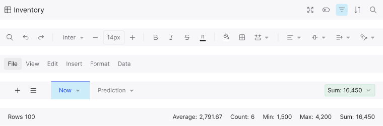
The Smart Footer: Answers at a Glance
The Footer is often treated as an afterthought, but in data-heavy interfaces, it’s a powerful part of the experience. It shouldn’t be limited to pagination alone.
| The user value: Users need answers quickly. They shouldn’t have to export data to Excel just to calculate a simple total or verify a selection. |
A well-designed footer turns the table into an active workspace:
- Instant context: The status bar should behave like a calculator. When a user selects a range of cells, show key values — such as Sum, Average, and Count — immediately, without additional actions.
- Sheet navigation (Tabs): Avoid forcing users to open multiple browser windows to compare datasets. Place tabs below the table to act as primary navigation for switching between sheets. This allows users to manage multiple complex views within a single instance, keeping their workflow fluid and uninterrupted.
From Component to Product
When accessibility is designed for speed, internationalization is treated as a first-class concern, and the footer provides real, contextual insight, the table stops being just another component in a system.
At this stage, you’re designing a workspace: a mini-product that supports real workflows, adapts to global users, and helps people to get their work done faster and with greater confidence.
Taming the Monster
Designing a data table for your design system looks easy at first. It begins as neat rows in Figma (Act I), quickly turns into a serious technical challenge (Act II), and ultimately becomes a critical workspace for real users (Act III).
If you ignore the reality of handling hundreds of thousands of rows, or the needs of power users who rely on speed and keyboard-driven workflows, the design will fail in the real world — no matter how clean it looks in mockups.
Remember: you’re not just drawing borders and padding. You’re designing a complex engine. Whether you build that logic from scratch or rely on a proven solution like Handsontable, the goal is the same: to turn the intimidating monster of raw data into a fast, reliable tool that helps users get their work done.