

Run Handsontable in a Salesforce Lightning Web Component
In this tutorial, you will run Handsontable inside a Salesforce Lightning Web Component, bound to live Account records. It covers only the glue between the grid and the platform: shipping the library as a static resource, getting its stylesheets across the shadow boundary, mapping Salesforce field metadata to column types, and turning grid hooks into Lightning Data Service calls. It assumes you already write Lightning Web Components.
Overview
Get the full source on GitHub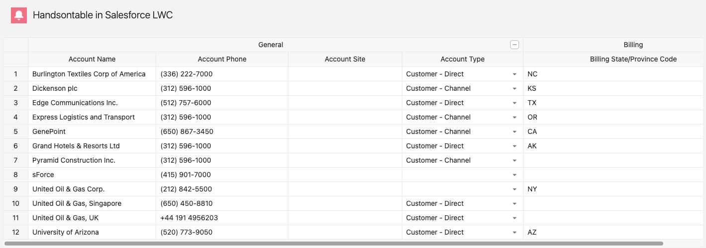
Difficulty: Intermediate
Time: ~30 minutes
Handsontable resolves mouse, focus, and clipboard events across the shadow boundary on its own, so clicking, the cell editors, copy and paste, and the context menu work under Lightning Web Security with no workaround code. The rest is the four points of contact this recipe wires up.
This recipe runs against real org data, so the grid cannot run inside this page. The code below is complete, but it arrives in pieces: each step adds members to a class you already started. The repository holds both components as whole files if you would rather read them that way, or deploy them and follow along.
What you’ll build
A Lightning app page with an editable grid of Account records:
- Handsontable loaded from a static resource, with no bundler and no npm dependency in the org.
- Column types derived from Salesforce field metadata: picklists become dropdowns, numeric fields become numeric cells, and checkboxes become boolean cells.
- Grouped, collapsible column headers built from field name prefixes such as
BillingandShipping. - Cell edits, new rows, and deleted rows saved to Salesforce through Lightning Data Service, with no Apex.
Two components: hotGrid loads the static resource, creates the instance, and re-exposes settings as @api properties and hooks as DOM events; handsontableApp reads Account metadata and records, builds the column configuration, and writes changes back. The wrapper carries no Account-specific code, so it works for any object.
Before you begin
You need the Salesforce CLI (sf) and an org you can deploy to - Developer Edition, a sandbox, or a Starter trial.
See the Shadow DOM guide for what the grid handles at the boundary.
You also need Account records in the All Accounts list view. Developer Edition orgs ship with sample accounts.
Authorize your org, and keep the alias - every command below targets it:
sf org login web --alias my-org --set-defaultIf you are starting from an empty directory, scaffold a project first:
sf project generate --name handsontable-lwccd handsontable-lwcAdd Handsontable as a static resource
Vendor three files from the package into a static resource and commit them:
Terminal window npm install handsontablemkdir -p force-app/main/default/staticresources/handsontablecp node_modules/handsontable/dist/handsontable.full.min.js \node_modules/handsontable/styles/handsontable.min.css \node_modules/handsontable/styles/ht-theme-main.min.css \force-app/main/default/staticresources/handsontable/That leaves the resource directory next to its metadata file:
force-app/main/default/staticresources/├── handsontable/│ ├── handsontable.full.min.js│ ├── handsontable.min.css│ └── ht-theme-main.min.css└── handsontable.resource-meta.xmlThe npm dependency records which version you vendored; to upgrade, bump the package and repeat the copy. Without node in the project, download the same three files from a version-pinned CDN: the script, the base stylesheet, and the theme stylesheet. Keep the version in the URL - a static resource is a snapshot, so an unpinned URL changes what you uploaded.
One archive resource keeps the three files on one version, and
${HANDSONTABLE}/<file>then addresses them. Three single-file resources work too, each with its owncontentTypeandresourceUrlimport.Create
handsontable.resource-meta.xmlbeside the directory:<?xml version="1.0" encoding="UTF-8"?><StaticResource xmlns="http://soap.sforce.com/2006/04/metadata"><cacheControl>Public</cacheControl><contentType>application/zip</contentType><description>Handsontable - JavaScript data grid with spreadsheet UX. Includes JS, CSS, and theme files.</description></StaticResource>contentTypeisapplication/zipbecause the CLI zips the directory on deploy; a Metadata API deploy needs the archive built yourself.Load both stylesheets in the next step.
handsontable.min.csscarries the grid’s structural styles, andht-theme-main.min.csscarries one theme. Without the structural stylesheet, cell editors open in the wrong position.Create the grid wrapper component
Generate the component:
Terminal window sf lightning generate component --type lwc --name hotGrid --output-dir force-app/main/default/lwcHandsontable writes its own DOM, so its container needs
lwc:dom="manual". The theme class goes on the same element:force-app/main/default/lwc/hotGrid/hotGrid.html <template><div class="grid-container ht-theme-main" lwc:dom="manual"></div></template>Load the resource in
renderedCallback, guarded by a flag. Order matters: both stylesheets, then the script, then the grid:force-app/main/default/lwc/hotGrid/hotGrid.js import { LightningElement, api } from 'lwc';import { loadScript, loadStyle } from 'lightning/platformResourceLoader';import HANDSONTABLE from '@salesforce/resourceUrl/handsontable';export default class HotGrid extends LightningElement {_hot = null;_initialized = false;_data = [];_columns = [];_nestedHeaders = [];_collapsibleColumns = [];renderedCallback() {if (this._initialized) {return;}this._initialized = true;loadStyle(this, `${HANDSONTABLE}/handsontable.min.css`).then(() => loadStyle(this, `${HANDSONTABLE}/ht-theme-main.min.css`)).then(() => loadScript(this, `${HANDSONTABLE}/handsontable.full.min.js`)).then(() => {const container = this.template.querySelector('.grid-container');if (container) {this._initializeGrid(container);}}).catch((error) => {console.error('HotGrid: failed to load', error?.message || error);});}disconnectedCallback() {if (this._hot) {this._hot.destroy();this._hot = null;}}_initializeGrid(container) {if (this._hot) {return;}const settings = {data: JSON.parse(JSON.stringify(this._data)),columns: this._columns.length ? this._columns : undefined,colHeaders: true,rowHeaders: true,height: 'auto',columnSorting: true,manualColumnResize: true,contextMenu: true,copyPaste: true,fillHandle: true,licenseKey: 'non-commercial-and-evaluation',afterChange: (changes, source) => {if (!changes || source === 'loadData') {return;}changes.forEach(([row, col, oldValue, newValue]) => {if (oldValue !== newValue) {this.dispatchEvent(new CustomEvent('cellchange', {detail: {row,physicalRow: this._hot.toPhysicalRow(row),col,oldValue,newValue,},}));}});},afterCreateRow: (index, amount) => {this.dispatchEvent(new CustomEvent('rowcreate', {detail: { index, physicalIndex: this._hot.toPhysicalRow(index), amount },}));},beforeRemoveRow: (index, amount, physicalRows) => {this.dispatchEvent(new CustomEvent('rowremoverequest', {detail: { physicalRows: [...physicalRows] },}));return false;},};if (this._nestedHeaders.length) {settings.nestedHeaders = this._nestedHeaders;settings.collapsibleColumns = this._collapsibleColumns.length? this._collapsibleColumns : true;}this._hot = new window.Handsontable(container, settings);}}Three details:
loadScriptattaches the library towindow.Handsontable, so the instance comes from the global, not from an import.destroy()indisconnectedCallbackis not optional. Lightning Experience keeps navigated-away pages in memory, and an undestroyed grid keeps its listeners and its resize observer.- The events carry physical row indexes. The hooks report visual indexes, which move when the user sorts a column, while the data component’s arrays keep source order - an event carrying only the visual index would resolve a different record after a sort.
toPhysicalRow()translates the first two, andbeforeRemoveRowalready receives its physical indexes as the third argument. See Understanding data and indexes.
Replace
licenseKeywith your commercial key before production. See License key.Keep the wrapper unexposed:
force-app/main/default/lwc/hotGrid/hotGrid.js-meta.xml <?xml version="1.0" encoding="UTF-8"?><LightningComponentBundle xmlns="http://soap.sforce.com/2006/04/metadata"><isExposed>false</isExposed><description>Core Handsontable wrapper component for LWC. Not intended for direct use on Lightning pages.</description></LightningComponentBundle>Understand which shadow DOM mode you are in
Lightning Experience renders components with a synthetic shadow DOM polyfill by default, and this recipe sets no
shadowSupportMode, so the grid runs in that mode. Step 2 is complete as written for it:loadStyleputs a<link>indocument.head, and synthetic shadow DOM lets those styles reach the component.To check which mode an org actually gives you, open the page with the grid on it, and run this in the browser console:
const probe = document.createElement('style');probe.textContent = '.ht_master td { color: rgb(255, 0, 0) !important; }';document.head.appendChild(probe);Red cell text means the styles are not encapsulated, so the component runs in synthetic shadow DOM. Unchanged text means a native shadow root.
Handsontable adds the
ht-shadow-domclass to its root wrapper in both modes. The class carriesisolation: isolate, which keeps the grid’s overlays from competing with the Lightning Experience UI - but the declaration lives inhandsontable.min.css, so the isolation only takes effect where that stylesheet reaches the grid. An unstyled grid has the class and none of the behavior.Use native shadow DOM
A native shadow root ignores
document.head, so withstatic shadowSupportMode = 'native'the grid renders unstyled: no cell borders, transparent backgrounds, and the browser’s default font. Load the stylesheets twice - once inside the shadow root for the grid, and once in the document head for the parts Handsontable renders outside it. Only the parts that change are shown here; the rest of the class stays as it is in Step 2:// force-app/main/default/lwc/hotGrid/hotGrid.js - changed parts onlyexport default class HotGrid extends LightningElement {static shadowSupportMode = 'native';renderedCallback() {if (this._initialized) {return;}this._initialized = true;const loadStylesheetInShadow = (href) => new Promise((resolve, reject) => {const link = document.createElement('link');link.rel = 'stylesheet';link.href = href;link.onload = resolve;link.onerror = () => reject(new Error(`Failed to load ${href}`));this.template.querySelector('.grid-container').appendChild(link);});Promise.all([loadStylesheetInShadow(`${HANDSONTABLE}/handsontable.min.css`),loadStylesheetInShadow(`${HANDSONTABLE}/ht-theme-main.min.css`),loadStyle(this, `${HANDSONTABLE}/handsontable.min.css`),loadStyle(this, `${HANDSONTABLE}/ht-theme-main.min.css`),]).then(() => loadScript(this, `${HANDSONTABLE}/handsontable.full.min.js`)).then(() => {const container = this.template.querySelector('.grid-container');if (container) {this._initializeGrid(container);}}).catch((error) => {console.error('HotGrid: failed to load', error?.message || error);});}}The shadow-root copies style the grid. The head copies style the context menu and the other dropdowns, which Handsontable renders into a portal in the document, outside the shadow root - drop them and the menu opens transparent, borderless, and without a shadow. The Shadow DOM guide shows the same split for a plain web component.
Lightning Experience caches component bundles per session, so after you redeploy the wrapper, check the styles in a private window. A hard refresh, and even a new tab, can still run the previous version.
Expose the grid’s settings and hooks
Each setting is an
@apiaccessor that also callsupdateSettings()once the grid exists, so a wire that resolves after the first render still reaches it. Add these insideHotGrid:// force-app/main/default/lwc/hotGrid/hotGrid.js - inside the class@apiget data() {return this._data;}set data(value) {this._data = value ? [...value] : [];if (this._hot) {this._hot.updateSettings({ data: JSON.parse(JSON.stringify(this._data)) });}}@apiget columns() {return this._columns;}set columns(value) {this._columns = value ? [...value] : [];if (this._hot) {this._hot.updateSettings({ columns: this._columns.length ? this._columns : undefined });}}@apiget nestedHeaders() {return this._nestedHeaders;}set nestedHeaders(value) {this._nestedHeaders = value ? [...value] : [];if (this._hot && this._nestedHeaders.length) {this._hot.updateSettings({ nestedHeaders: this._nestedHeaders });}}@apiget collapsibleColumns() {return this._collapsibleColumns;}set collapsibleColumns(value) {this._collapsibleColumns = value ? [...value] : [];if (this._hot && this._collapsibleColumns.length) {this._hot.updateSettings({ collapsibleColumns: this._collapsibleColumns });}}@apigetDataAtCell(row, col) {return this._hot ? this._hot.getDataAtCell(row, col) : null;}_nestedHeadersand_collapsibleColumnsare already declared in Step 2, and_initializeGrid()already reads them - grouped headers replacecolHeaderswhen the data component supplies them.Every setting the data component binds needs an accessor here, and a missing one fails silently: with
nestedHeadersnever set, the grid falls back tocolHeaders: trueand labels the columnsA,B,Cinstead of the field names.The copies are load-bearing. Handsontable mutates the data source it is given, and a parent’s reactive state arrives as a read-only proxy, so the deep copy and the array spreads are what keep the grid from writing into it. Skip them and the grid renders, every edit is rejected, the cell snaps back, and no
afterChangefires.The three hooks in that same settings object turn grid activity into DOM events.
afterChangeskips theloadDatasource, because without that guard the first data load reports every cell as an edit and the org receives a write for each one.The two row hooks have opposite shapes on purpose.
afterCreateRowreports a row the grid has already added, and that row stays local until the data component turns it into a record.beforeRemoveRowreturnsfalse, which cancels the removal: the data component ownsdata, so it decides when the row disappears and can put it back when the org refuses the delete.Build the columns from Salesforce field metadata
Generate the data component:
Terminal window sf lightning generate component --type lwc --name handsontableApp --output-dir force-app/main/default/lwcIts template wires the grid’s properties and events:
force-app/main/default/lwc/handsontableApp/handsontableApp.html <template><template if:true={error}><div class="slds-text-color_error slds-p-around_small">{error}</div></template><c-hot-griddata={data}columns={columns}nested-headers={nestedHeaders}collapsible-columns={collapsibleColumns}oncellchange={handleCellChange}onrowcreate={handleRowCreate}onrowremoverequest={handleRowRemoveRequest}></c-hot-grid></template>Four wire adapters feed the grid:
getObjectInfofor data types and labels,getListInfoByNamefor the list view’s columns,getListRecordsByNamefor the records, andgetPicklistValuesByRecordTypefor dropdown sources. The last one is easy to miss -getObjectInforeports that a field is a picklist but never lists its values, so a dropdown built from it offers nothing to choose.The two list adapters chain:
getListRecordsByNametakes afieldsargument of qualified field names, whichgetListInfoByNamesupplies through itsdisplayColumns. The records do not wait for it - while'$_listFields'is stillundefined, the adapter emits the records once with empty field maps, then again with the field data once the names arrive. The builder skips the fieldless emission, and the other adapters resolve independently, so each wire calls the same builder and the builder waits for everything it reads.Two traps in this pair, both verified against a live org. The adapters take
objectApiNameas a plain string: unlikegetObjectInfo, they do not accept the@salesforce/schemaobject, and handed one they never provision - no request, no data, no error, and the grid renders empty with nothing in the console. And older examples usegetListUifromlightning/uiListApifor the same job - Salesforce has deprecated it, and these two adapters are its replacement.force-app/main/default/lwc/handsontableApp/handsontableApp.js import { LightningElement, wire } from 'lwc';import { getListInfoByName, getListRecordsByName } from 'lightning/uiListsApi';import { getObjectInfo, getPicklistValuesByRecordType } from 'lightning/uiObjectInfoApi';import { updateRecord, createRecord, deleteRecord } from 'lightning/uiRecordApi';import ACCOUNT_OBJECT from '@salesforce/schema/Account';const SKIP_FIELDS = ['Id', 'OwnerId', 'Owner', 'CreatedById', 'LastModifiedById','LastModifiedDate', 'CreatedDate', 'SystemModstamp', 'IsDeleted','LastViewedDate', 'LastReferencedDate', 'MasterRecordId','PhotoUrl', 'CleanStatus', 'OperatingHoursId'];const NUMERIC_SF_TYPES = ['Currency', 'Double', 'Int', 'Percent', 'Long'];const GROUP_PREFIXES = ['Billing', 'Shipping'];export default class HandsontableApp extends LightningElement {data = [];columns = [];nestedHeaders = [];collapsibleColumns = [];error = null;_recordIds = [];_fieldApiNames = [];_objectInfo = null;_listRecords = null;_picklists = null;_recordTypeId = undefined;_listFields = undefined;@wire(getObjectInfo, { objectApiName: ACCOUNT_OBJECT })wiredObjectInfo({ data, error }) {if (data) {this._objectInfo = data;this._recordTypeId = data.defaultRecordTypeId;this._buildGrid();} else if (error) {this.error = error.body?.message || 'Failed to load Account metadata';}}@wire(getPicklistValuesByRecordType, {objectApiName: ACCOUNT_OBJECT,recordTypeId: '$_recordTypeId',})wiredPicklists({ data, error }) {if (data) {this._picklists = data.picklistFieldValues;this._buildGrid();} else if (error) {this._picklists = {};this._buildGrid();}}@wire(getListInfoByName, {objectApiName: 'Account',listViewApiName: 'AllAccounts',})wiredListInfo({ data, error }) {if (data) {this._listFields = data.displayColumns.map((column) => `Account.${column.fieldApiName}`,);} else if (error) {this.error = error.body?.message || 'Failed to load the list view';}}@wire(getListRecordsByName, {objectApiName: 'Account',listViewApiName: 'AllAccounts',fields: '$_listFields',pageSize: 50,})wiredAccounts({ data, error }) {if (data) {this._listRecords = data;this._buildGrid();} else if (error) {this.error = error.body?.message || 'Failed to load Accounts';}}}The builder maps each Salesforce data type to a Handsontable cell type. Picklist entries become the
sourceof a dropdown, the numeric Salesforce types become numeric cells, and booleans become checkboxes:// force-app/main/default/lwc/handsontableApp/handsontableApp.js - inside the class_columnFor(fieldApiName, fieldInfo) {if (!fieldInfo) {return { type: 'text' };}if (fieldInfo.dataType === 'Picklist') {const picklist = this._picklists ? this._picklists[fieldApiName] : null;const values = [''];(picklist ? picklist.values : []).forEach((entry) => {values.push(entry.value);});return { type: 'dropdown', source: values };}if (NUMERIC_SF_TYPES.includes(fieldInfo.dataType)) {return { type: 'numeric' };}if (fieldInfo.dataType === 'Boolean') {return { type: 'checkbox' };}return { type: 'text' };}Fill the
sourcewith each entry’svalue, not itslabel. The two differ on code-based picklists - a state field storesNCwhile its label readsNorth Carolina- and the record payload carries the value. Source the labels instead and the grid offers choices the API rejects: the cell showsNC, the dropdown listsNorth Carolina, and picking it fails the save withAn error occurred while trying to update the record.SKIP_FIELDSdrops the fields that make no sense in a grid: system audit fields, and the ID and relationship fields whose values are not scalars. A relationship field such asOwnercarries a nested record object rather than a string, so a cell would render[object Object].Read the field list off the first returned record rather than off the metadata.
getObjectInfodescribes every field on the object, while the records carry only the fields the list view displays - thefieldsargument built fromdisplayColumns. A column built from metadata that the payload does not carry renders empty even when the record holds a value - and an edit to that empty cell still writes, so it silently overwrites the stored value with whatever the user typed. The grid then re-renders from the refreshed payload, the cell goes blank again, and the write looks like it failed when it did not.Accounts carry two obvious field groups,
Billing*andShipping*, which map onto nested headers with collapsible columns. The builder groups the fields by prefix, emits one header cell per group with acolspan, and flattens the records into the array of arrays the grid renders:// force-app/main/default/lwc/handsontableApp/handsontableApp.js - inside the class_groupOf(fieldName) {const prefix = GROUP_PREFIXES.find((candidate) => fieldName.startsWith(candidate));return prefix || 'General';}_buildGrid() {if (!this._objectInfo || !this._listRecords || !this._picklists) {return;}const records = this._listRecords.records;if (!records || records.length === 0) {this.error = 'No accounts found';return;}const fieldInfoMap = this._objectInfo.fields;const availableFields = Object.keys(records[0].fields).filter((field) => !SKIP_FIELDS.includes(field));if (!availableFields.length) {return;}const groups = {};const groupOrder = [];availableFields.forEach((field) => {const group = this._groupOf(field);if (!groups[group]) {groups[group] = [];groupOrder.push(group);}groups[group].push(field);});groupOrder.sort((a, b) => {if (a === 'General') {return -1;}if (b === 'General') {return 1;}return a.localeCompare(b);});const orderedFields = [];groupOrder.forEach((group) => orderedFields.push(...groups[group]));const groupRow = [];const fieldRow = [];const collapsible = [];let colIndex = 0;groupOrder.forEach((group) => {const fields = groups[group];groupRow.push({ label: group, colspan: fields.length });collapsible.push({ row: -2, col: colIndex, collapsible: true });fields.forEach((field) => {const info = fieldInfoMap[field];fieldRow.push(info ? info.label : field);});colIndex += fields.length;});this.nestedHeaders = [groupRow, fieldRow];this.collapsibleColumns = collapsible;this.columns = orderedFields.map((field) => this._columnFor(field, fieldInfoMap[field]));this._fieldApiNames = orderedFields;this._recordIds = records.map((record) => record.id);this.data = records.map((record) => orderedFields.map((field) => {const value = record.fields[field]?.value;return value != null ? value : '';}));this.error = null;}The
row: -2in each collapsible entry addresses the upper of the two header rows. Header rows count upward from the data, so the group row of a two-row header is-2and the field row is-1.The
_recordIdsand_fieldApiNamesarrays are what turn a cell coordinate back into a Salesforce field on a Salesforce record, which is how Step 6 saves an edit.Stock All Accounts returns
Name,Site,Phone,Type, andBillingStateCode- one dropdown and four text columns. AddEmployees,Annual Revenue, or a checkbox field through List View Controls > Select Fields to Display, or pointlistViewApiNameat your own list view, and those columns arrive asnumericandcheckboxcells with no code change.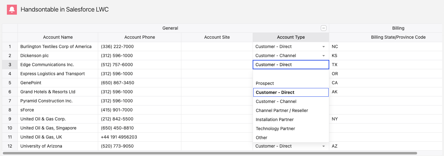
Save changes back to Salesforce
Each grid event maps to one Lightning Data Service call. A cell edit resolves to a record ID and a field API name, and
updateRecordwrites it.First, a helper for the error path. A rejected call puts
An error occurred while trying to update the record. Please try again.inerror.body.message, and the real reason inerror.body.output.errors. Read the specific one when it is there:// force-app/main/default/lwc/handsontableApp/handsontableApp.js - inside the class_messageFrom(error, fallback) {const recordErrors = error?.body?.output?.errors;if (recordErrors && recordErrors.length) {return recordErrors.map((entry) => entry.message).join(' ');}return error?.body?.message || fallback;}Without it, a refused delete says “please try again” and the user retries forever. With it, the grid shows the org’s own explanation of what blocked the write.
// force-app/main/default/lwc/handsontableApp/handsontableApp.js - inside the classhandleCellChange(event) {const { physicalRow, col, newValue } = event.detail;const recordId = this._recordIds[physicalRow];const fieldName = this._fieldApiNames[col];if (!recordId || !fieldName) {return;}updateRecord({ fields: { Id: recordId, [fieldName]: newValue } }).catch((error) => {this.error = this._messageFrom(error, 'Save failed');});}A new row needs deferring. Handsontable fires
afterCreateRowwhile the row is still empty, and a paste fills its cells afterwards, so creating the record immediately would save a blank one. Insert anullplaceholder in_recordIdsto keep the row-to-record mapping aligned, then read the row back on the next tick and create the record from whatever landed in it:// force-app/main/default/lwc/handsontableApp/handsontableApp.js - inside the classhandleRowCreate(event) {const { index, physicalIndex, amount } = event.detail;const grid = this.template.querySelector('c-hot-grid');for (let i = 0; i < amount; i++) {const visualRow = index + i;const physicalRow = physicalIndex + i;this._recordIds.splice(physicalRow, 0, null);// eslint-disable-next-line @lwc/lwc/no-async-operationsetTimeout(() => {const fields = {};this._fieldApiNames.forEach((field, col) => {const value = grid?.getDataAtCell?.(visualRow, col);if (value != null && value !== '') {fields[field] = value;}});if (!fields.Name) {fields.Name = 'New Account';}createRecord({ apiName: 'Account', fields }).then((record) => {this._recordIds[physicalRow] = record.id;}).catch((error) => {this.error = this._messageFrom(error, 'Create failed');});}, 100);}}The handler uses both indexes on purpose:
getDataAtCell()takes the visual row, while_recordIdskeeps source order, so the placeholder and the saved ID land at the physical row.The
nullplaceholder also protectshandleCellChange: a cell edit on a row whose record does not exist yet finds no ID and returns instead of writing to the wrong record.createRecorddoes not refresh the list view, so the new row keeps whatever the user typed into it and shows no server-side values - the record exists, butgetListRecordsByNamestill returns the page it fetched before the insert. Reload the page, or callrefreshApexon the wired list result, when the row has to come back from the server.Deletes are the one call the org refuses often, so the row removal is optimistic and reversible. Take the rows out of
dataright away, fire the deletes, and put the rows back at the same indexes if any of them rejects. The wrapper sends physical indexes, and on a sorted grid a contiguous visual selection maps to scattered physical rows, so the handler splices per row instead of once:// force-app/main/default/lwc/handsontableApp/handsontableApp.js - inside the classhandleRowRemoveRequest(event) {const physicalRows = [...event.detail.physicalRows].sort((a, b) => a - b);const removed = physicalRows.map((row) => ({row,recordId: this._recordIds[row],values: this.data[row],}));[...removed].reverse().forEach(({ row }) => {this._recordIds.splice(row, 1);});this.data = this.data.filter((rowValues, row) => !physicalRows.includes(row));this.error = null;Promise.all(removed.map(({ recordId }) => (recordId ? deleteRecord(recordId) : Promise.resolve()))).catch((error) => {const restored = [...this.data];removed.forEach(({ row, recordId, values }) => {this._recordIds.splice(row, 0, recordId);restored.splice(row, 0, values);});this.data = restored;this.error = this._messageFrom(error, 'Delete failed');});}Capture the
removedentries before you splice, because they are what the rollback puts back. Removal runs highest index first, and the rollback lowest first, so no splice shifts the indexes the next one uses. Each assignment tothis.datais a new array, which is what pushes the change through the@apisetter and intoupdateSettings().Without the rollback the grid disagrees with the org: the row is gone locally, the record is not, and nothing says so until a reload. Refused deletes are common - Salesforce blocks deleting an account that has related cases or closed-won opportunities.
Expose this component so it can be dropped onto a Lightning page:
force-app/main/default/lwc/handsontableApp/handsontableApp.js-meta.xml <?xml version="1.0" encoding="UTF-8"?><LightningComponentBundle xmlns="http://soap.sforce.com/2006/04/metadata"><isExposed>true</isExposed><masterLabel>Handsontable</masterLabel><targets><target>lightning__AppPage</target><target>lightning__HomePage</target><target>lightning__RecordPage</target></targets></LightningComponentBundle>Deploy and open the grid
Drop the component onto an app page in Lightning App Builder, or deploy the page as metadata:
force-app/main/default/flexipages/Handsontable_Grid.flexipage-meta.xml <?xml version="1.0" encoding="UTF-8"?><FlexiPage xmlns="http://soap.sforce.com/2006/04/metadata"><flexiPageRegions><itemInstances><componentInstance><componentName>handsontableApp</componentName><identifier>c_handsontableApp</identifier></componentInstance></itemInstances><name>main</name><type>Region</type></flexiPageRegions><masterLabel>Handsontable Grid</masterLabel><template><name>flexipage:defaultAppHomeTemplate</name></template><type>AppPage</type></FlexiPage>Leave the region’s
modeout -<mode>Replace</mode>underflexipage:defaultAppHomeTemplatefails the deploy.force-app/main/default/tabs/Handsontable_Grid.tab-meta.xml <?xml version="1.0" encoding="UTF-8"?><CustomTab xmlns="http://soap.sforce.com/2006/04/metadata"><flexiPage>Handsontable_Grid</flexiPage><label>Handsontable Grid</label><motif>Custom53: Bell</motif></CustomTab>force-app/main/default/permissionsets/Handsontable_Grid.permissionset-meta.xml <?xml version="1.0" encoding="UTF-8"?><PermissionSet xmlns="http://soap.sforce.com/2006/04/metadata"><label>Handsontable Grid</label><hasActivationRequired>false</hasActivationRequired><tabSettings><tab>Handsontable_Grid</tab><visibility>Visible</visibility></tabSettings></PermissionSet>Deploy, assign the permission set, and open the page:
Terminal window sf project deploy start --source-dir force-app/main/default --target-org my-orgsf org assign permset --name Handsontable_Grid --target-org my-orgsf org open --target-org my-org --path "/lightning/n/Handsontable_Grid"Edit a cell and reload the page. The value persists, because it went to the org and came back from it.
Known limitations
- Tabbing in from another component focuses the grid without selecting a cell, so the arrow keys do nothing until the user clicks. Select one yourself on
focusin- the web component recipe shows that listener. - The grid holds one list view page - 50 records here. For more, page through the list view or drive the grid with the
dataProviderplugin against Apex. - One call per cell edit and per removed row, so a wide paste is one
updateRecordper cell. Batch through Apex for bulk editing. - Dependent picklists offer every value. Each entry carries a
validFormask naming its controlling values, which_columnForignores, so a state field lists the states of every country. Filtervaluesper row against the controlling field. - Field-level security is enforced by the API, not the grid: a read-only field still accepts input and fails on save. Mark those columns
readOnly.
What you learned
- The grid ships as a static resource and is created from
window.Handsontableafter its stylesheets resolve. - Field metadata generates the column configuration, and the list view payload decides which fields exist.
- Settings cross as
@apiproperties, forwarded throughupdateSettings()and deep-copied out of the reactive proxy. - Hooks become DOM events, each mapping to one Lightning Data Service call, with
beforeRemoveRowmaking deletes reversible and the wrapper forwarding physical row indexes so a sorted grid still writes to the record the user edited.
Next steps
- Shadow DOM - what Handsontable resolves at the shadow boundary, and how to load styles inside a shadow root.
- Server-side data - move pagination, sorting, and filtering to the server for larger objects.
- Cell types - extend the field-type mapping with dates, times, and custom editors.