
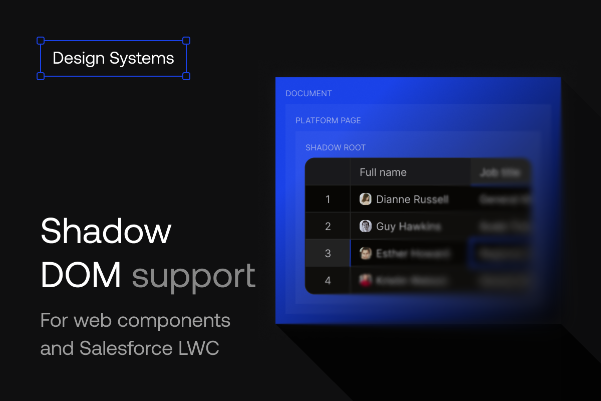
Handsontable already runs inside shadow roots. Customers ship it inside Salesforce Lightning Web Components, inside design-system components, inside widgets embedded in pages they do not own. Getting there took a wrapper that bridged the shadow boundary: a few event handlers, a clipboard path, one line of CSS isolation.
As of 18.1.1, the core library does that work. What’s left of the wrapper is glue, not workarounds: load the resources, call the constructor.
Where this matters
The Shadow DOM is a browser standard that gives a component an encapsulated DOM subtree of its own. Inside a shadow root, markup, styles, and IDs stay sealed off from the host page: page CSS cannot cascade in, component CSS cannot leak out. Components keep their styling in a host page they know nothing about, leave the host’s styling untouched, and compose at scale.
That guarantee is why design systems ship as web components: build the component once, and it runs in every framework its consumers use. It is a platform decision, usually made long before anyone drops a data grid into a page.
Web components are the choice made by systems that run inside somebody else’s page, or that outlive somebody else’s framework:
- Platform vendors, where third-party apps render inside the vendor’s own shell: Salesforce Lightning (LWC), ServiceNow, SAP UI5, Shopify Polaris.
- Vendor systems that ship framework-agnostic: Google Material Web, Microsoft Fluent UI Web Components, Adobe Spectrum Web Components, IBM Carbon, Red Hat.
- Public sector, where a system outlives several framework cycles: New York State, Ontario, and Tyler Forge across US state and municipal government.
- Enterprises with many brands and long-lived internal apps: Porsche, Michelin Motion, Esri Calcite, Alaska Airlines Auro, Nordhealth Nord, Duet by LocalTapiola.
The tooling layer points the same way. Authoring tools like Lit and Stencil, and libraries such as Shoelace (now Web Awesome) and ING’s Lion, all exist to make custom elements the shipping format — and most of them attach a shadow root by default. Micro-frontends and embeddable widgets arrive from the other side: your code renders inside a page you do not own, and encapsulation is what guarantees it will not disturb that page.
If any of this describes your stack, the grid you embed lives in a shadow root, and 18.1.1 is the release where that stops needing arrangements around it.
What the wrapper used to carry
The seal that protects the host page also changes what a component sees. Stylesheets load inside the shadow root rather than from the page. Events that cross the boundary get retargeted, so a library reading event.target sees the host element rather than the clicked cell, and focus resolves the same way. A grid runs on exactly those signals: which cell you pressed, what holds focus, where the caret is.
Five pieces of the boundary needed arranging, and the host wrapper was the place to arrange them:
- Keeping the cell editor open when a click lands inside it.
- Restoring selection and keyboard focus after in-grid clicks.
- Supplying a clipboard path that works under Lightning Web Security.
- Handing focus back to the host page when the reader moves to something like the Salesforce global search.
- Containing the grid’s stacking context so frozen headers stay behind the platform navigation.
A wrapper can reach three of these from the outside. The other two only work when the library resolves the click itself, so the core now handles all five.
Salesforce as the reference target
Lightning Experience runs LWC on a synthetic shadow polyfill, and Lightning Web Security wraps DOM APIs in a security sandbox on top of that. A library there deals with patched browser APIs rather than a real shadow boundary. It is also where most of our customers hit this problem. We tested both environments separately: real shadow roots in Lit, Stencil, and vanilla custom elements for the standards case, and a real Salesforce Developer Edition org — not a test harness — for the sandboxed one. During development that included setups no one should ship: grids nested several synthetic shadow roots deep, and two grids on one Lightning page handing focus back and forth.
What came out of that work is a reference component you can deploy to your own org: live Account records through Lightning Data Service, no Apex, full create, read, update, and delete — and no workaround code anywhere in it.
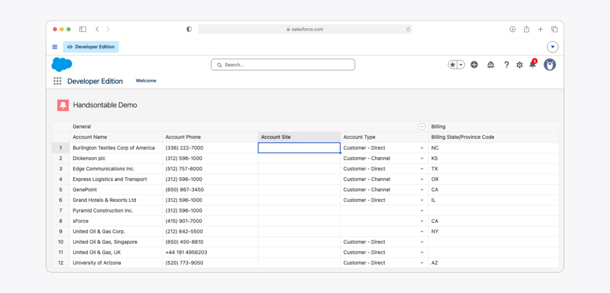
Salesforce LWC component: https://github.com/handsontable/salesforce-lwc/
What 18.1.1 changes
The core library detects the shadow boundary and resolves mouse, focus, and clipboard events through it. Under sandboxed platforms such as Lightning Web Security it switches to signals that stay reliable there. The core styles create an isolated stacking context in shadow-root embeddings, keeping the grid’s internal z-index values behind the host page’s navigation. Cell editing, selection, keyboard navigation, and copy and paste behave as they do in the regular DOM.
Inside an LWC, none of the boundary work remains. The component loads Handsontable and its two stylesheets from a static resource with loadScript and loadStyle, and then the grid itself is one call:
this._hot = new Handsontable(container, settings);
Lightning Web Security sanitizes writes to shared DOM, which does not include a component’s own shadow root, where the grid writes. So the sanitizer option carries the same weight here as in any other embedding: set it if your header labels, menu items, or pasted HTML come from users or an API. The reference component ships one you can copy.
The whole setup, in one custom element
Less than 60 lines, no framework. A few rules apply: load the styles inside the shadow root (base stylesheet plus a theme), load the theme in the document head as well, wait for them before creating the grid, and pick the theme with the themeName option.
const CDN = "https://cdn.jsdelivr.net/npm/handsontable@18.1.1";
const CORE_CSS = `${CDN}/styles/handsontable.min.css`;
const THEME_CSS = `${CDN}/styles/ht-theme-main.min.css`;

const load = (element, parent) =>
  new Promise((resolve, reject) => {
    element.onload = resolve;
    element.onerror = () => reject(new Error(`Failed to load ${element.src || element.href}`));
    parent.appendChild(element);
  });

const stylesheet = (href, parent) =>
  load(Object.assign(document.createElement("link"), { rel: "stylesheet", href }), parent);

const documentAssets = Promise.all([
  load(Object.assign(document.createElement("script"), { src: `${CDN}/dist/handsontable.full.min.js` }), document.head),
  stylesheet(THEME_CSS, document.head),
]);

class HotShadowDemo extends HTMLElement {
  async connectedCallback() {
    const root = this.attachShadow({ mode: "open" });
    const container = document.createElement("div");

    root.appendChild(container);

    await Promise.all([
      documentAssets,
      stylesheet(CORE_CSS, root),
      stylesheet(THEME_CSS, root),
    ]);

    this.hot = new Handsontable(container, {
      data: [
        ["Acme Corp", "Q1 2026", 4200000],
        ["Vertex Industries", "Q1 2026", 18700000],
        ["Harbor Goods", "Q1 2026", 6350000],
      ],
      colHeaders: ["Company", "Quarter", "Revenue"],
      columns: [{ type: "text" }, { type: "text" }, { type: "numeric" }],
      rowHeaders: true,
      contextMenu: true,
      themeName: "ht-theme-main",
      height: "auto",
      licenseKey: "non-commercial-and-evaluation",
    });
  }

  disconnectedCallback() {
    this.hot?.destroy();
  }
}

customElements.define("hot-shadow-demo", HotShadowDemo);
Swap the evaluation licenseKey for your own before this reaches a Lightning page or any other production host.
Both stylesheets inside the shadow root matter. Skip the base one and the grid still renders, but interactive elements such as the cell editor land in wrong positions. Create the grid before the stylesheets finish loading and Handsontable warns about missing theme styles, then measures cells against unstyled elements.
The theme is loaded twice on purpose. Context menus and dropdowns do not render inside the shadow root; they go into a portal element in the light DOM, and a stylesheet loaded inside a shadow root cannot reach it. Handsontable does put the theme class on that portal, so the theme only needs to be present in the document for the menus to pick it up. Load it in the shadow root alone and your menus open in the browser’s default serif at the wrong row height, next to a grid that looks nothing like them.
Handsontable also injects its core stylesheet into the document head, which is what gives those portalled menus their structure. Leave that copy alone. Setting injectCoreCss: false will not keep the head clean anyway, because the first context menu you open puts it back.
The library and the document-level theme load at module scope rather than inside connectedCallback, so they run once however many elements you mount. Move them into the callback and three elements give you three <script> tags, which means the bundle executes three times and rebinds the global on each run. The stylesheets inside each shadow root are the opposite case: those belong to the individual component and have to be loaded per instance.
Load inside the shadow root, wait for the load, and the rest is a standard Handsontable setup.
Grids built before the layout exists
A shadow host that fills its <slot> a tick after connectedCallback hands the grid a container with no layout boxes. So does a subtree you assemble first and append later, or one that starts out display: none. In that state the browser resolves getComputedStyle() to an empty declaration for the container and every ancestor, so the grid finds no scrolling ancestor and binds its overlays to window scroll for the life of the instance. Column headers and frozen columns stop following the body, virtualization renders the whole data set, and row heights get recorded at values the rows never had.
Lit and Stencil components hit this most often, because slotted light DOM arrives late by design. 18.1.1 treats the answer as provisional until the table actually renders, settles it on the first draw, and throws out the sizes measured against nothing.
Code you can delete
If you already run Handsontable in a shadow root, your wrapper holds the boundary work the core now does. This is the shape it usually takes, from a customer proof of concept: a capture-phase mouse interceptor, a hand-written clipboard with copyPaste: false next to it, and a line of CSS isolation.
// Keeps the editor open on click.
container.addEventListener(
  "mousedown",
  e => {
    const editor = this._hot?.getActiveEditor();
    if (editor && editor.isOpened && editor.isOpened()) {
      const ta = editor.TEXTAREA;
      if (ta) {
        const rect = ta.getBoundingClientRect();
        if (
          e.clientX >= rect.left &&
          e.clientX <= rect.right &&
          e.clientY >= rect.top &&
          e.clientY <= rect.bottom
        ) {
          e.stopImmediatePropagation();
          setTimeout(() => ta.focus(), 0);
        }
      }
    }
  },
  true,
);

// Supplies the clipboard, with copyPaste: false in the settings.
container.addEventListener("keydown", e => {
  if ((e.metaKey || e.ctrlKey) && e.key === "c") {
    /* ~30 lines */
  }
  if ((e.metaKey || e.ctrlKey) && e.key === "v") {
    /* ~30 lines */
  }
});

// Keeps frozen headers behind the host page's navigation.
container.style.isolation = "isolate";
Around 80 lines, and every line of it is now the library’s job.
To move over:
- Update to 18.1.1.
- Remove the event and clipboard handlers, including any
copyPaste: falsethat made room for a custom clipboard. - Drop the post-mount
updateSettings({})orrefreshDimensions()nudge, if you added one to straighten out headers, scroll range, or a grid that paints blank until the first click. - Keep both stylesheets loading inside the shadow root.
Grids in the regular DOM need no changes at all. A few edge cases are worth reading about first, so check the known limitations before you upgrade.
Where to go next
The Shadow DOM guide documents the full setup: styles inside the shadow root, behavior on sandboxed platforms, and the limitations list. Two recipes turn each path in this post into a step-by-step build: run Handsontable in a Salesforce Lightning Web Component, or wrap it in a web component. Read them once, then let the grid do the rest.