Introducing the new Handsontable spreadsheet icons
 News / January 23, 2019
This article was originally written by Marcin Kordacki, a senior designer at dedend.
I’ve been working for Handsontable for almost two years now. Over that period I’ve created a completely new look of this brand. As part of this effort, I decided to create a spreadsheet icon set from scratch. The idea was to create something that would perfectly complement the existing system of visual identification as well as upcoming changes to the product such as a new toolbar, context menu and more.
I figured the biggest challenge with developing the icons, apart from their readability and look, would be their weight. I also wanted the design to be transparent and legible, with the additional benefit of strengthening the image of Handsontable.
I began with sketching a quick draft. The trick to projects like this is starting the creative process as fast as possible. For me, the best tools here are a notebook and a pencil. If something doesn’t fit on a sheet of paper, it won’t work on a computer screen either. Although this solution may seem archaic, it works best when designing fonts.
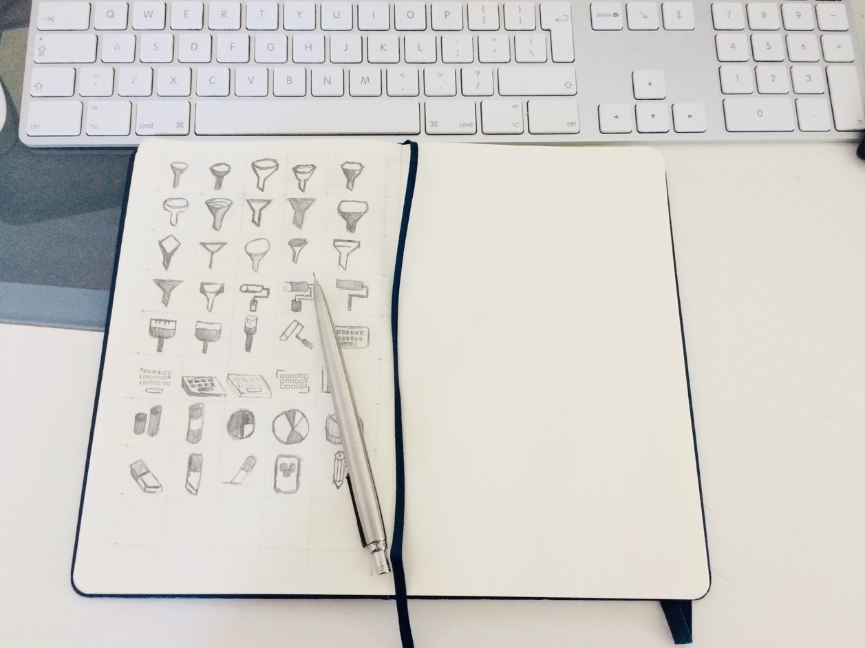
Eventually, three minimalist styles were created, on which I started more detailed work. When designing fonts (both the iconographic and simple types) the most important factors are correct dimensioning. I decided that the size of the grid should be 24 pixels and that the characters would take up 18 of them.
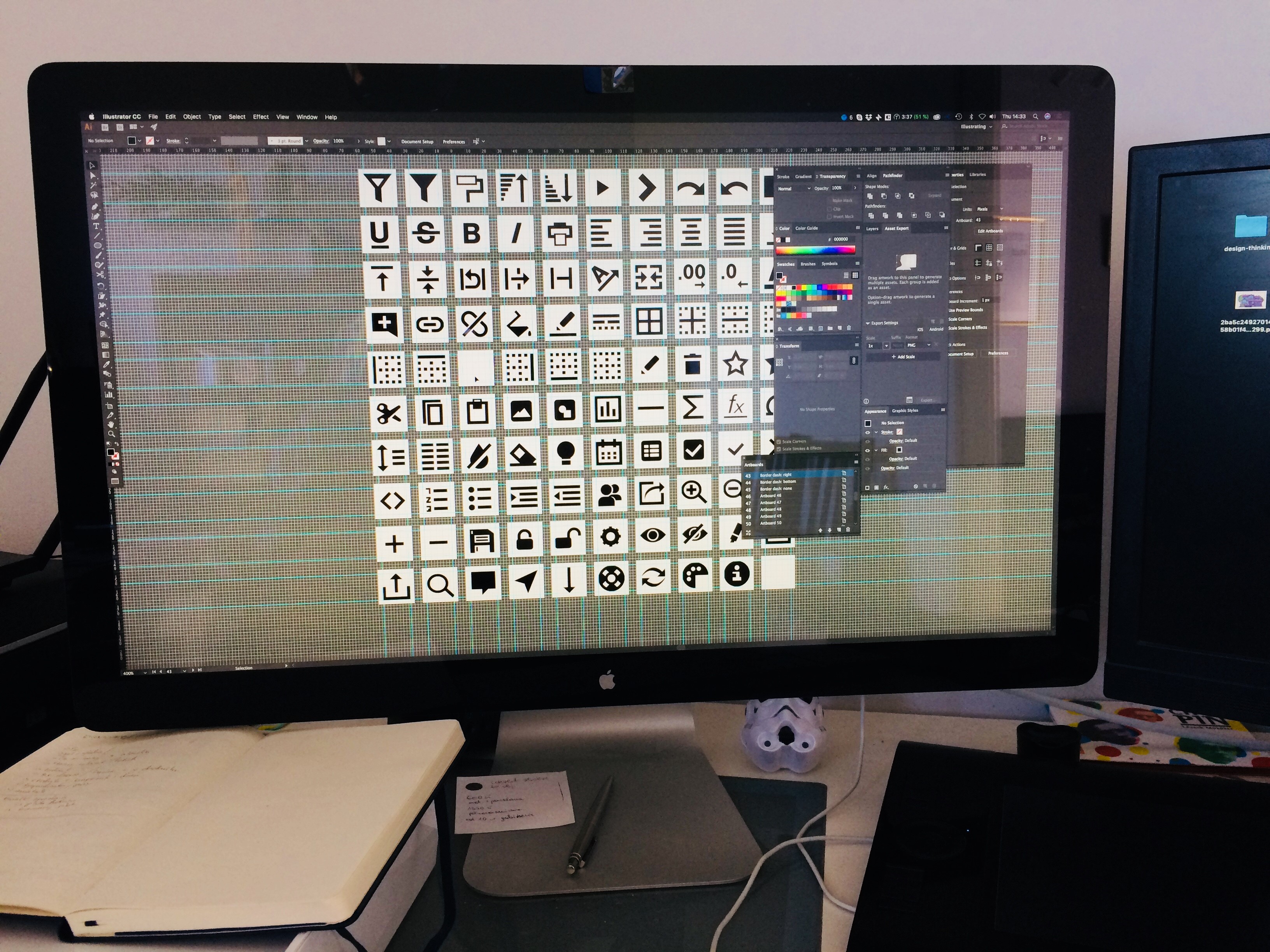
The challenge is that, in contrast to fonts or graphics characters intended for printing, I was limited by screen resolution. In order to avoid nasty blurriness, I had to create icons that were precise in each pixel.
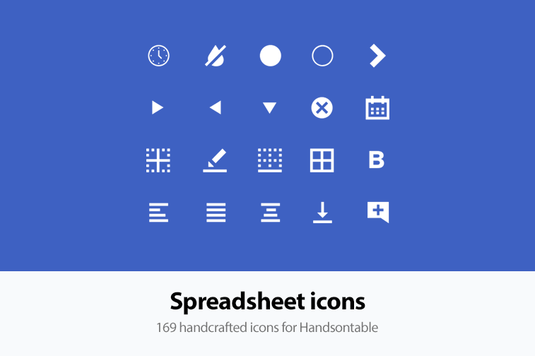
The effect was immediately noticeable during the first trials. The quality of the icons, along with their transparency and readability, met my expectations. After completing the trials and determining the graphic style, all that was left was to design the actual characters. In the end, I produced 169 of them.
During the post-production process, I wanted to use Fontello to create an icon font containing all the available characters. Unfortunately, it was too heavy to be useful for our purposes. Nevertheless, I think that Fontello is a helpful tool in this area and I will definitely use it in the future.
Overall, the project was a challenge, but also an extremely pleasant and creative process. As a designer who has worked on the Handsontable brand for some time, I regard creating fonts and icons as the icing on the cake. Projects like this beautifully complement complex systems of visual identification.
Note: Spreadsheet Icons are only available for the commercial version of Handsontable.
Peter Plesa
Generic bio alert: I like doing things and learning more about stuff.