
Every design system eventually runs into the same problem.
You’ve carefully defined your color tokens, spacing scale, and typography. Your buttons, inputs, and modals all follow the rules. And then someone drops a data grid into the app, and suddenly there’s a foreign object on the screen — different borders, different font sizes, a shade of blue that belongs to nobody.
The grid is technically functional. It just doesn’t look like it belongs.
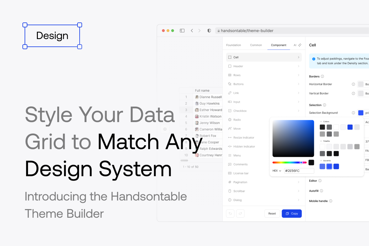
This is the gap the Handsontable Theme Builder was built to close.
The design system mismatch problem
Third-party UI components have always been a tension point in design systems. The more complex the component, the harder it is to make it look native to your app. A button is easy to style. A data grid — with its headers, selection states, scrollbars, editors, and dropdown menus — is a different beast entirely.
The old approach was to override Handsontable’s CSS classes manually. It worked, but it was fragile: internal class names could change between versions, specificity wars were common, and you’d often end up with a brittle layer of custom CSS that only one person on the team understood.
Handsontable 17.0 introduced a new Themes API that replaces that with a structured token model. Themes are now built around scalable color palettes and size tokens based on an 8px grid, making it straightforward to connect the grid’s visual language to an existing design system. Customization works both through CSS variables and a JavaScript Token API for runtime adjustments.
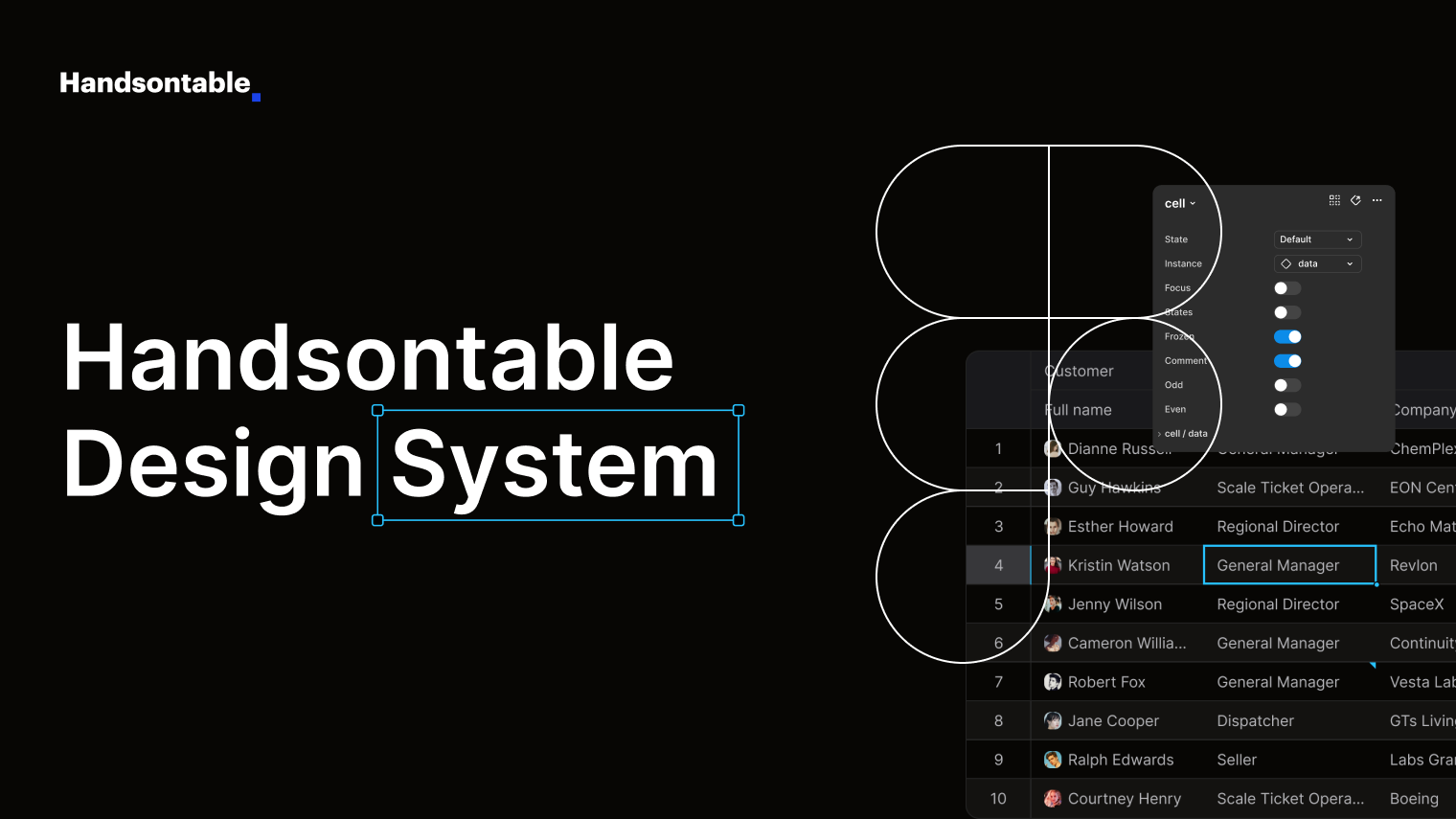
The Theme Builder is the visual layer on top of that system — and it’s organized around the same four-part structure that defines a theme.
How the Theme Builder is structured
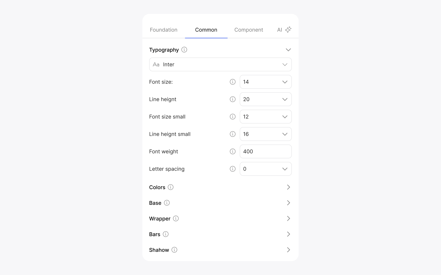
A theme in Handsontable is made up of four elements: token mapping, color palette, icon set, and density. The Theme Builder maps to this directly through its Foundation tab — the first place you land, and the right place to start.
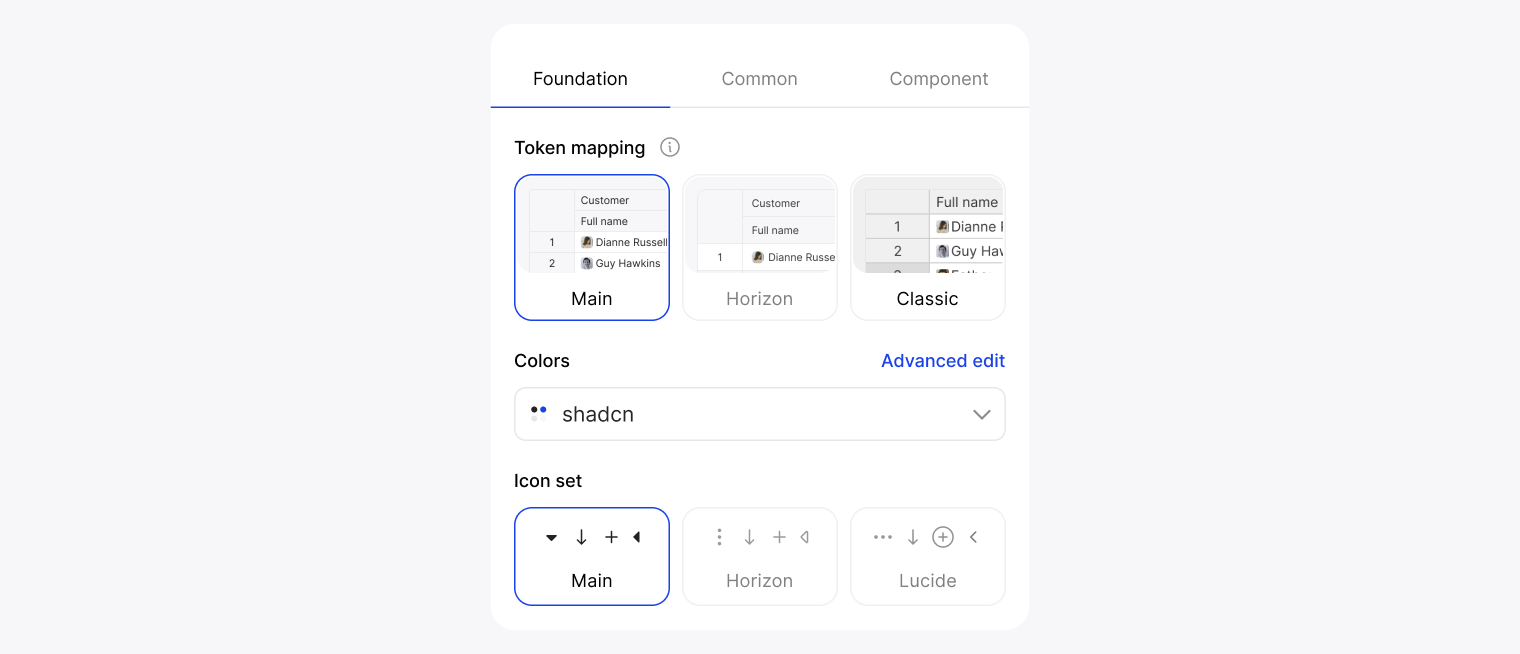
Token mapping is your base. Choose from Main, Horizon, or Classic — each one defines a different starting point for how tokens are wired to visual values. This choice shapes everything downstream.
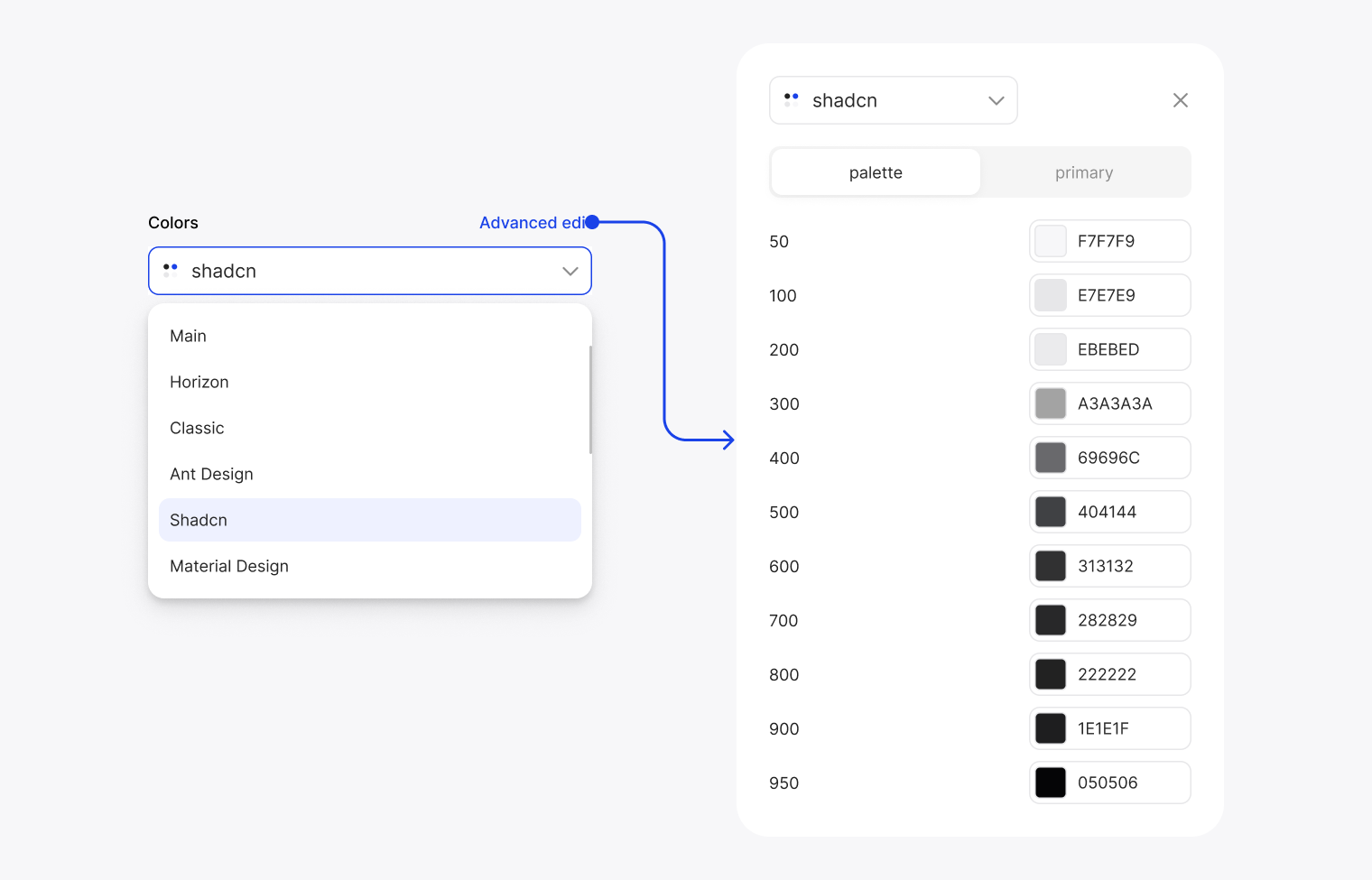
Colors determines the palette those tokens draw from. Beyond Handsontable’s own palettes (Main, Horizon, Classic), you can select Ant, Shadcn, or Material — meaning if your app already uses one of these design systems, the grid can immediately speak the same color language. For teams with a custom palette, the Advanced edit mode exposes the full 50–950 scale, hex value by hex value.
Icon set lets you choose between two sets of icons used across the grid’s UI — sort arrows, menu icons, resize handles. A small detail that makes a real difference when the grid sits next to other components.
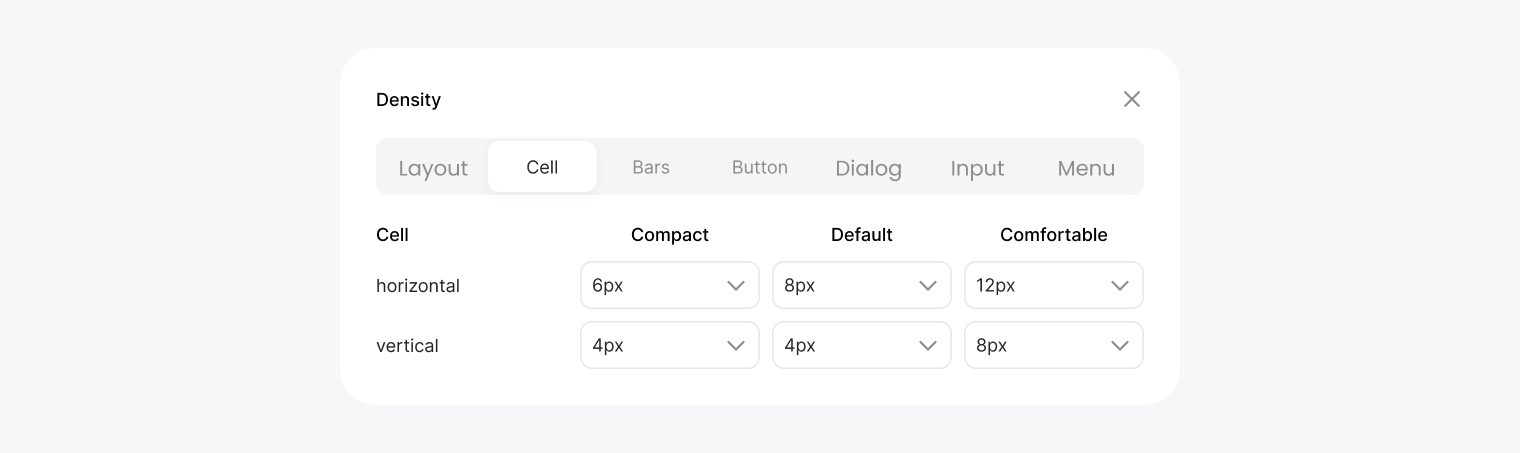
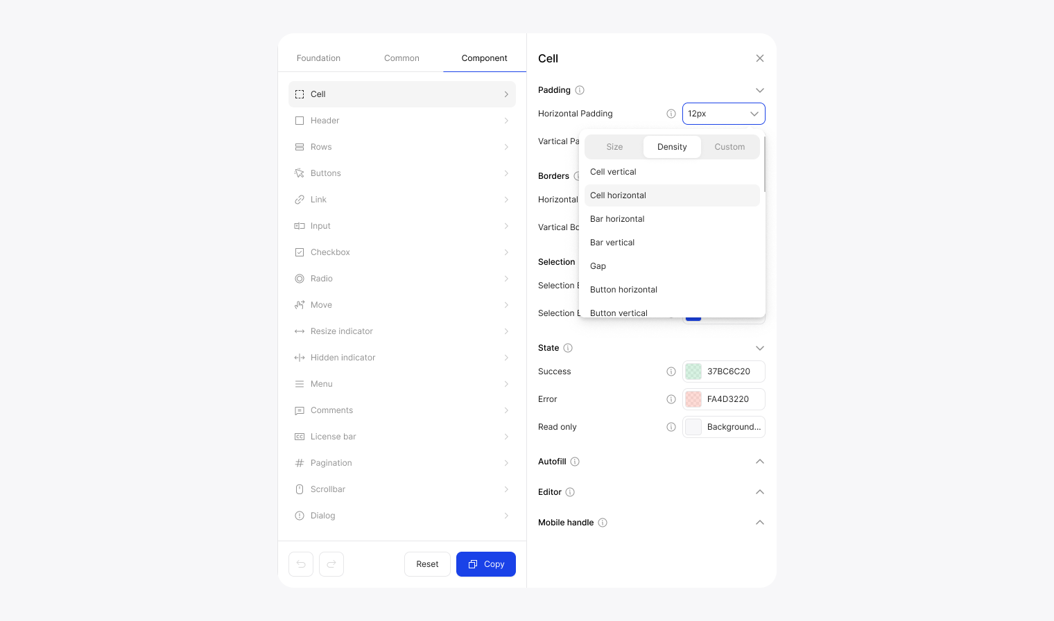
Density controls spacing across the entire grid in one go — compact, default, or comfortable — with granular control per component group (cells, bars, buttons, dialogs, inputs, menus) if you want to go further.
Going deeper: Common and Component
Foundation sets the global assumptions. The next two tabs let you refine them.
Common is where typography lives — font family, size, line height, weight, letter spacing — alongside semantic color tokens like Accent, Foreground, Background, Border, and their secondary and state variants. These tokens reference the palette you chose in Foundation, so changing the palette upstream cascades through the whole system. Common also covers base-level sizing: gap, icon size, table transition timing, wrapper and bar styling.
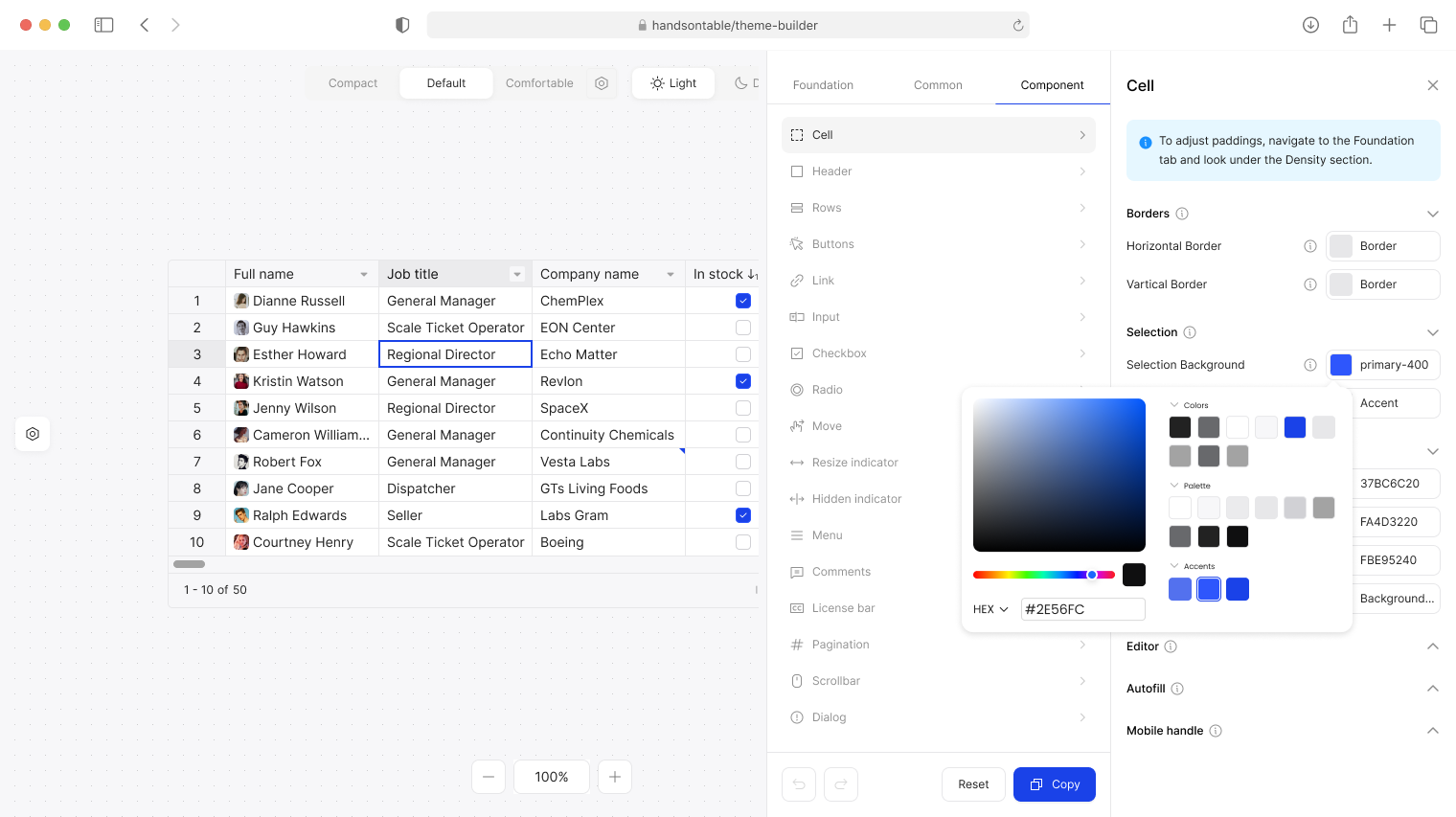
Component is the precision layer. It lists every component in the grid — Cell, Header, Rows, Buttons, Links, Inputs, Checkboxes, Radio Buttons, Menu, Comments, Pagination, Dialog, MultiSelect, Scrollbar, and more. Selecting any one opens a detailed panel with token controls per state: base, highlighted, active, filtered. Each token shows a tooltip explaining exactly what it affects, and every value can be reset individually.
This is where design system integration happens at the component level — where you can make the active column header match your primary brand color exactly, or ensure the filter state uses the same success green as the rest of your UI.
Live preview and export
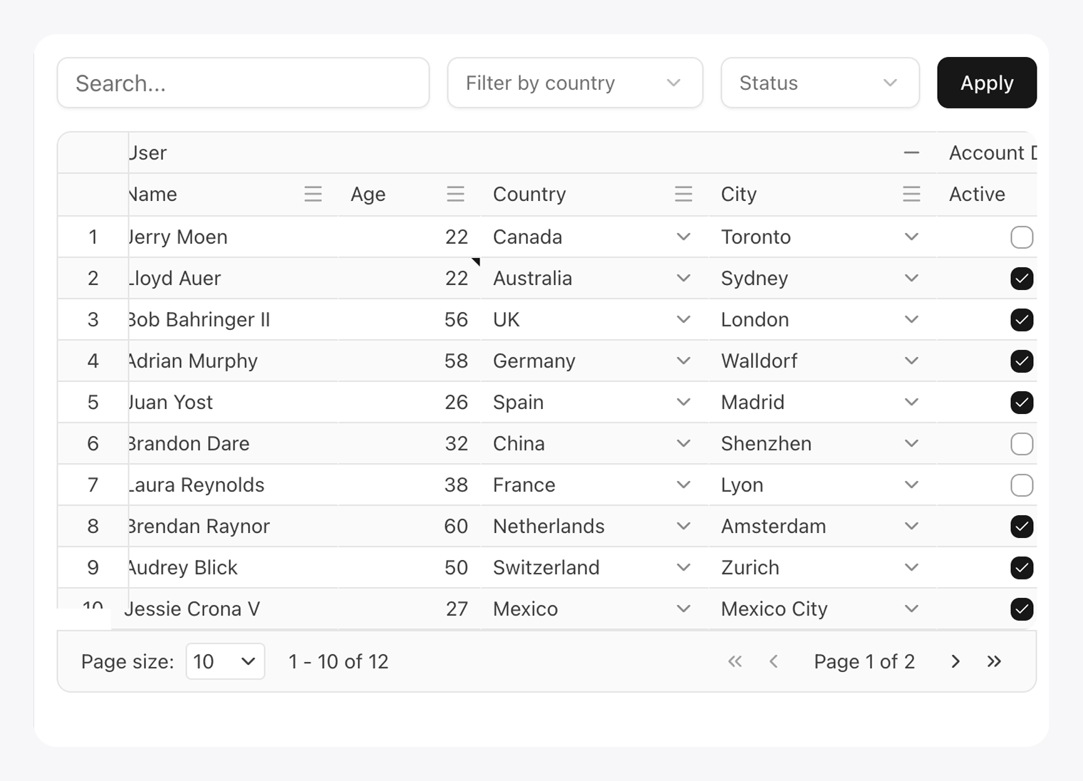
Every change across all three tabs is reflected immediately in the live grid preview — with real data, real interactions, and real states visible. You can switch between compact, default, and comfortable density on the fly, and toggle between light and dark mode, all without leaving the tool.
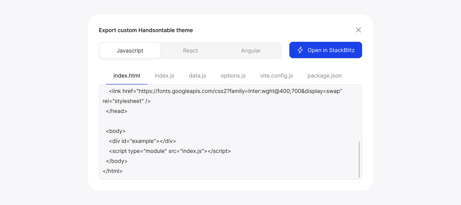
When you’re done, Generate code produces a ready-to-use project for JavaScript, React, or Angular — with all files included, and an option to open it directly in StackBlitz.
The Figma connection
If your team works from a design system maintained in Figma, there’s a more direct path.
We publish the Handsontable Design System on Figma Community — a component library that mirrors the actual grid 1:1, updated to v2.0 alongside the 17.0 release. Designers work with real grid components that share the same token structure as the code. When the design is finalized, those tokens map directly to the Themes API, removing the translation layer between design and implementation.
The design system includes built-in guidance for three workflows: creating a custom theme using Figma’s Local Variables, adding a custom icon set by replacing the default icon variants, and exporting variables using the Design Tokens plugin directly to a JSON file ready for Handsontable. Full step-by-step instructions are inside the Figma file itself, and the Design System docs cover the developer side of the handoff.
Less guesswork at handoff. No “can you make it look more like the mockup?” back-and-forth.
Going further: wiring into an established design system
If you’re integrating into an established design system like shadcn/ui, the token model makes it straightforward to map your existing design tokens directly onto the grid — beyond what the Builder’s preset palettes offer out of the box.
We published a step-by-step recipe for exactly that in our Recipes section: how to register a custom theme in a Next.js + shadcn/ui project, wire shadcn’s –primary, –background, –border, and –radius variables to Handsontable tokens, and match even the sort arrow icons to your design system.
Because tokens resolve at render time, the grid follows light/dark mode automatically. Your theme, your tokens, your rules.
Custom cell types play well too
Theming covers the visual layer, but design systems often have opinions about more than just colors — they have their own date pickers, dropdowns, and input components. Handsontable’s custom cell API lets you bring those in directly.
The custom cells docs cover how to wire up any editor or renderer to the grid, and the cell type recipes include ready-to-use examples for common cases — Flatpickr, Pikaday, color pickers, star ratings, and more. Combine that with a matching theme and the grid stops looking like a third-party component and starts feeling like something you built.
Where to start
Try it without any setup: handsontable.com/theme-builder
Read the full token reference: Theme Customization docs
Work from Figma: Handsontable Design System on Figma Community
Integrate with shadcn/ui: Handsontable + shadcn/ui recipe
Build custom editors and renderers: Custom cells docs · Cell type recipes
The grid should look like it was always part of your app. Now it can.