Newest
v18.1.2
2026-10-07
- Entitlement license keys survive line wrapping by mail clients
- A key with edited human-readable text is rejected

Handsontable DataGrid takes its look from a theme you define: your colors, type, spacing and density, mapped onto its tokens. Ship it once as a design-system component, and every team’s grid matches the rest of the product.
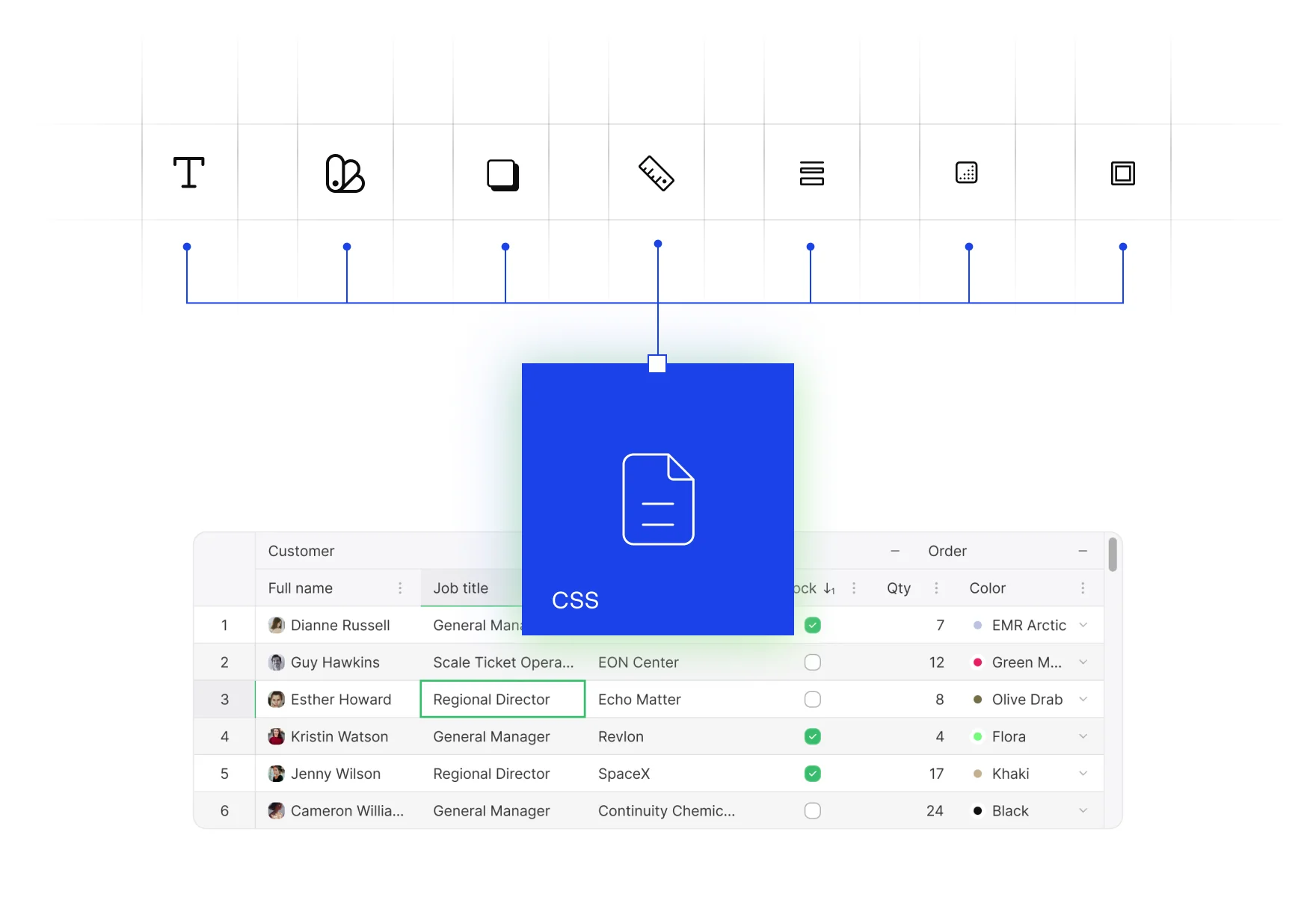
A button is easy to theme. A data grid brings headers, selection, editors, menus and scrollbars, and a third-party one arrives with a look of its own. Teams override internal class names that change between versions, and the grid stays the one component that never quite matches.
Six example themes, each a few lines of tokens on the Themes API, none of them shipped with the grid. Pick one and the grid restyles while it runs: colors and type change, and the rows, your sort and your filters stay where they were. Density is one setting for every theme; change it and the grid re-spaces.
Space, an example theme: Dark, mono type.
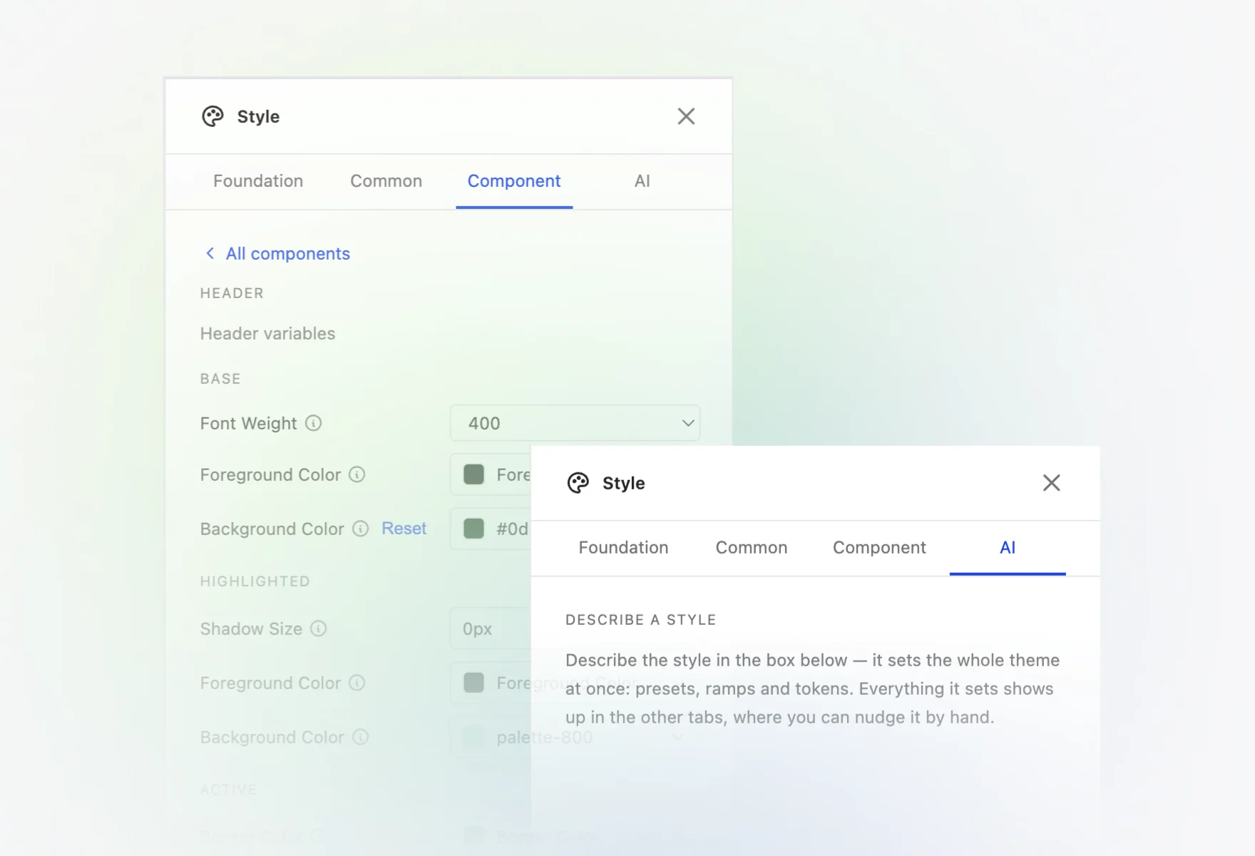
The Theme Builder lays a theme out in Common and Component layers, previews it on a real grid as you change a token, and exports the result. Start from your palette and adjust from there.
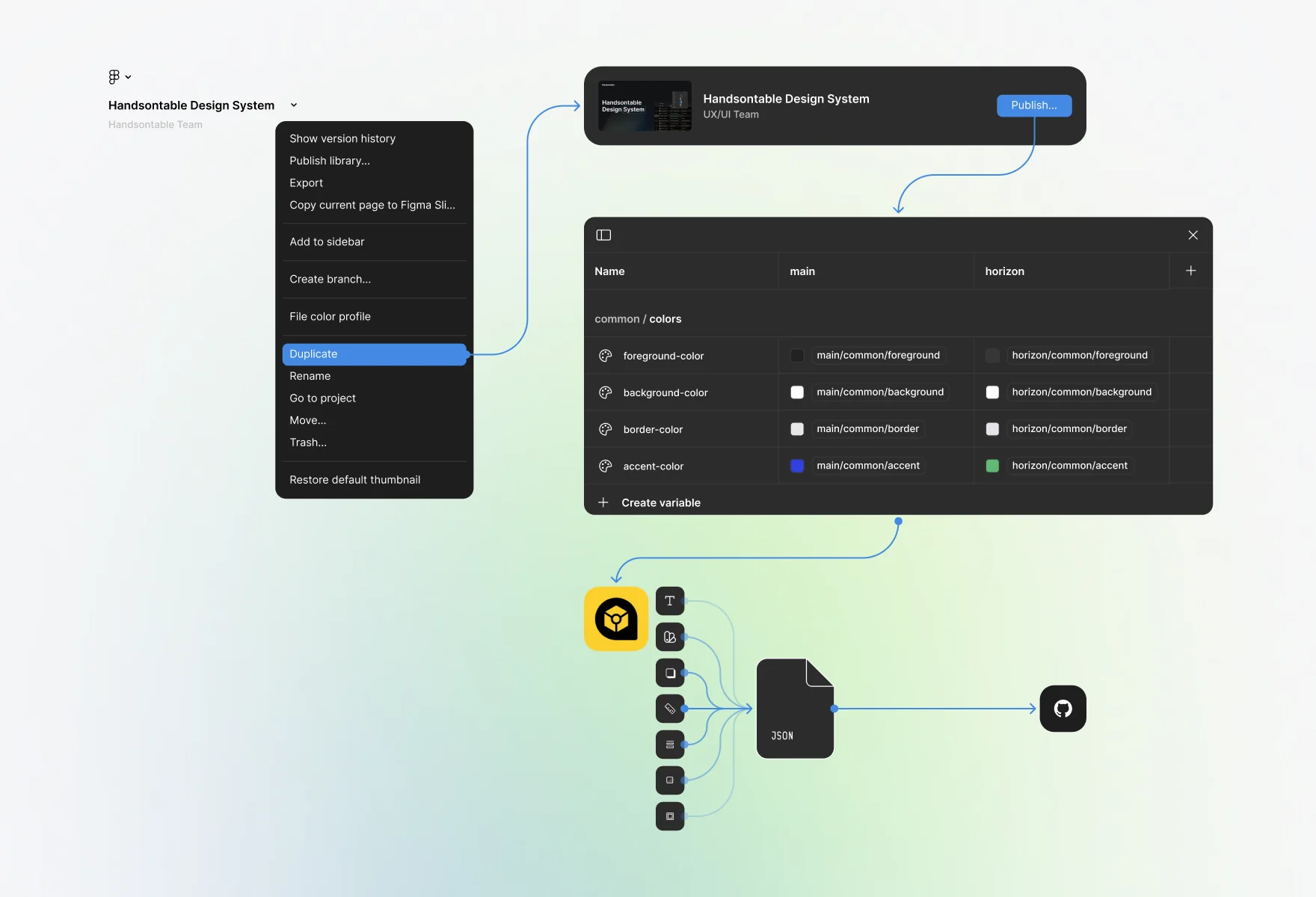
Designers work with real grid components in the Handsontable Design System on Figma Community, built on the same tokens as the code. Export the variables with the Design Tokens plugin and they map straight onto the Themes API.
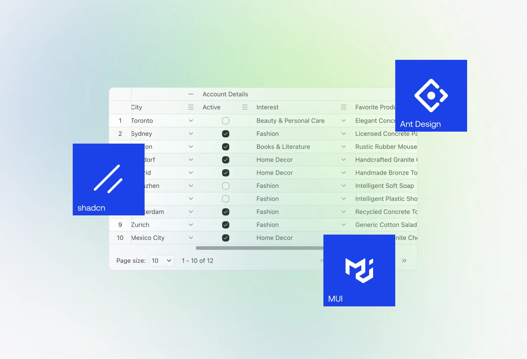
A recipe in the docs maps shadcn/ui’s --primary, --background, --border and --radius onto the grid’s tokens in a Next.js project, down to the sort icons. The same approach works for any design system built on CSS variables.
Design systems that ship as web components — Lit, Stencil or plain custom elements — get the grid inside their shadow roots. As of 18.1.1 the core resolves mouse, focus and clipboard events through the boundary itself.
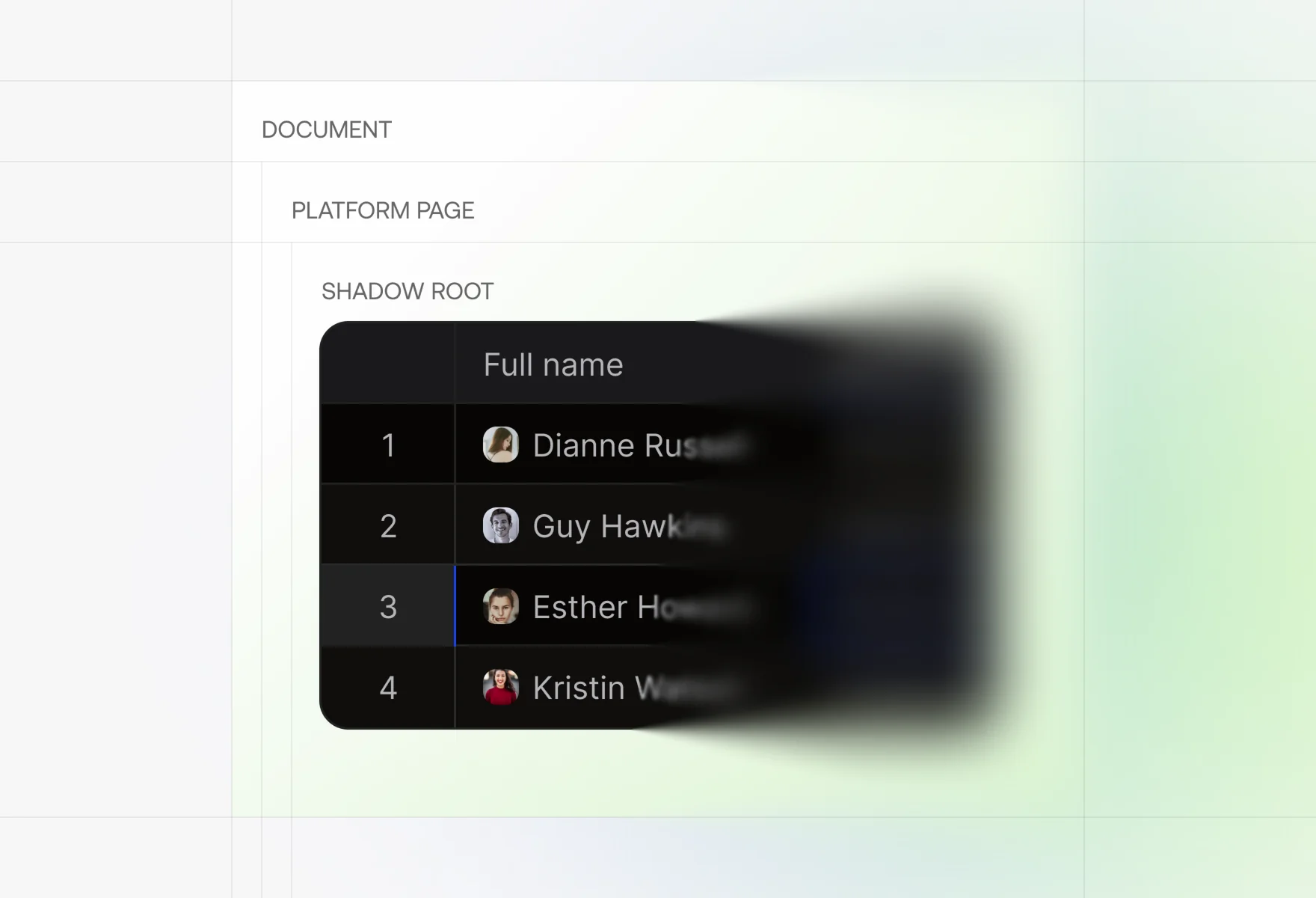
Register a theme from the Main theme with your tokens on top and hand it to every grid. The tokens can point at your design system’s own CSS variables, so a change to the system reaches every grid that uses it.
import Handsontable from 'handsontable';import { mainTheme, registerTheme } from 'handsontable/themes';// Your design system's tokens, mapped onto the grid's.const brandTheme = registerTheme({...mainTheme,name: 'brand',tokens: {...mainTheme.tokens,fontFamily: 'var(--ds-font-sans)',accentColor: 'var(--ds-color-primary)',foregroundColor: 'var(--ds-color-text)',backgroundColor: 'var(--ds-color-surface)',borderColor: 'var(--ds-color-border)',borderRadius: 'var(--ds-radius)',},});new Handsontable(container, {theme: brandTheme,data,licenseKey: 'non-commercial-and-evaluation',});
Two minor releases a month. One major release a quarter. Long-term support on every major for 24 months. No surprise breaking changes.
v18.1.2
2026-10-07
v18.1.1
2026-09-15
v18.1.0
2026-09-01
v18.0.0
2026-06-30
v17.1.0
2026-05-19
v17.0.0
2026-03-09
Evaluated against WCAG 2.2 Level A and AA, including keyboard navigation, screen readers, color contrast and ARIA, with a published Accessibility Conformance Report (VPAT) for your review.
Read the VPAT reportLet’s make it easier.
Smoother. Faster. All Handsontable.